Coffee Kit: Astra website and wireframe handoff
12 November 2026. Companion to UX/source evidence. Use the parent synthesis for the final offer, release scope, provider decision and pricing. This handoff requests no implementation or publication by the research agent.
Product story and IA
Founder ambition: a replacement-worthy “#1 solution for selling coffee on Shopify.” Do not publish “#1” as an independently established ranking. Show a coherent destination after migration, which may be salesperson/AI assisted: source document → reviewed coffee → offer → shopper experience → next-lot maintenance. Avoid presenting the product as an indefinite stack of unrelated overlays.
Admin navigation includes Overview, Coffee data, Design elements, Subscriptions, Loyalty, Demand & stock, Connections and Settings. One approved coffee catalog feeds every surface. One offer owns commercial rules; its card, PDP control and subscription builder are presentations of that offer. Shopify remains the commercial product/variant/inventory authority. The synthesis must identify the owner of recurring billing and customer changes.
Latest merchant positioning: “The complete solution for selling coffee on Shopify.” Use concrete product headings for coffee data management, SEO/AI discoverability, subscription builders, loyalty, inventory planning and agency customization. The supporting copy explains outcomes. Avoid poetic roastery slogans as the primary software-product proposition. The discoverability specification and demand specification define the new visual and operational scope.
First wireframes:
- Overview: continue setup, needs attention, recent work, experience status. Any numbers are visibly sample data.
- Coffee import review: source page/image and selected region beside existing/proposed facts; unresolved conflicts; shared field mapping; actual card/PDP preview; save draft versus approved apply action.
- Subscription offer: internal/public name, provider/capability, fixed coffee versus rotating club, eligible products/variants, grind/quantity, cadence/pricing, shopper summary, existing-subscriber impact.
- Experience builder: configuration, actual storefront preview, readiness/placement checks. Draft, Preview ready, Placement added and Live verified are different states.
- Shopper: direct known-coffee route and help-me-choose route; shared coffee/club, grind, weight, frequency and editable order summary. Inline desktop form with summary; progressive mobile presentation.
- Upcoming delivery concept: date, contents, price, edit cutoff, supported changes and operational-owner handoff. Label it as proposed until implemented.
Use real current Polaris 2 web components for admin wireframes where possible. Parent is verifying current component docs: App Home web components. Do not use old Polaris React 12 or style the entire admin like the storefront. Keep branded previews within the admin shell. Label simulated host navigation, publication, connections, payment and analytics as prototype behavior.
Exact real assets to use
Paths below are relative to research/coffee-kit-study/notes/. The evidence report links the original supplied design files as well.
| Website panel | Preferred image | Truthful status |
|---|---|---|
| Main card/grid value | Live collection | Coffeetale foundation, not a deployed Coffee Kit app |
| Rich coffee PDP | Live Ethiopia Guji | Existing themed presentation; reviewed data backend is proposed |
| Taste discovery | Selected mood | Live control changed 28 initial matches to 10 |
| Guided recommendations | Completed quiz | One four-question path returned four cards; relevance/uplift not benchmarked |
| Current purchase panel | Live quick buy | Panel opened; cart submission and checkout not tested |
| Recipe content | Live brew guide | Tabs/specifications rendered; Figma's elapsed stopwatch is additional work |
| Future subscription builder | Inline supplied concept | Proposed recurring purchase UI, not functioning billing |
| Short subscription path | Compact supplied concept | Alternate presentation of the same proposed offer |
| Full facts composition | Supplied coffee specification | Existing design reference with illustrative content/comments |
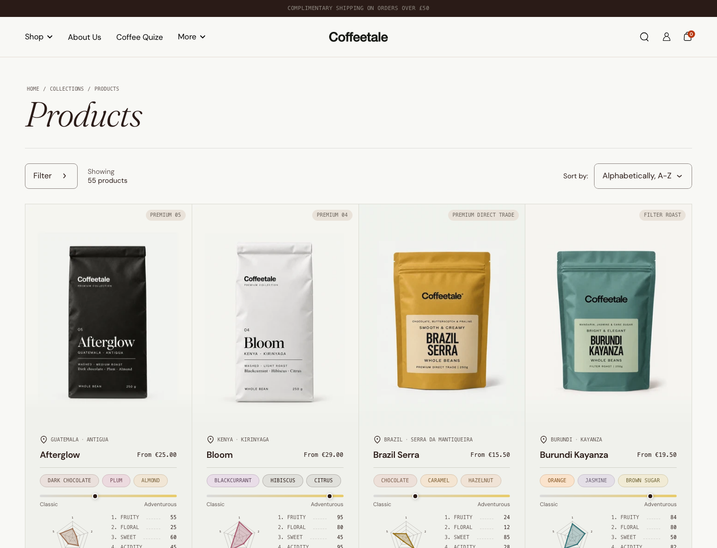
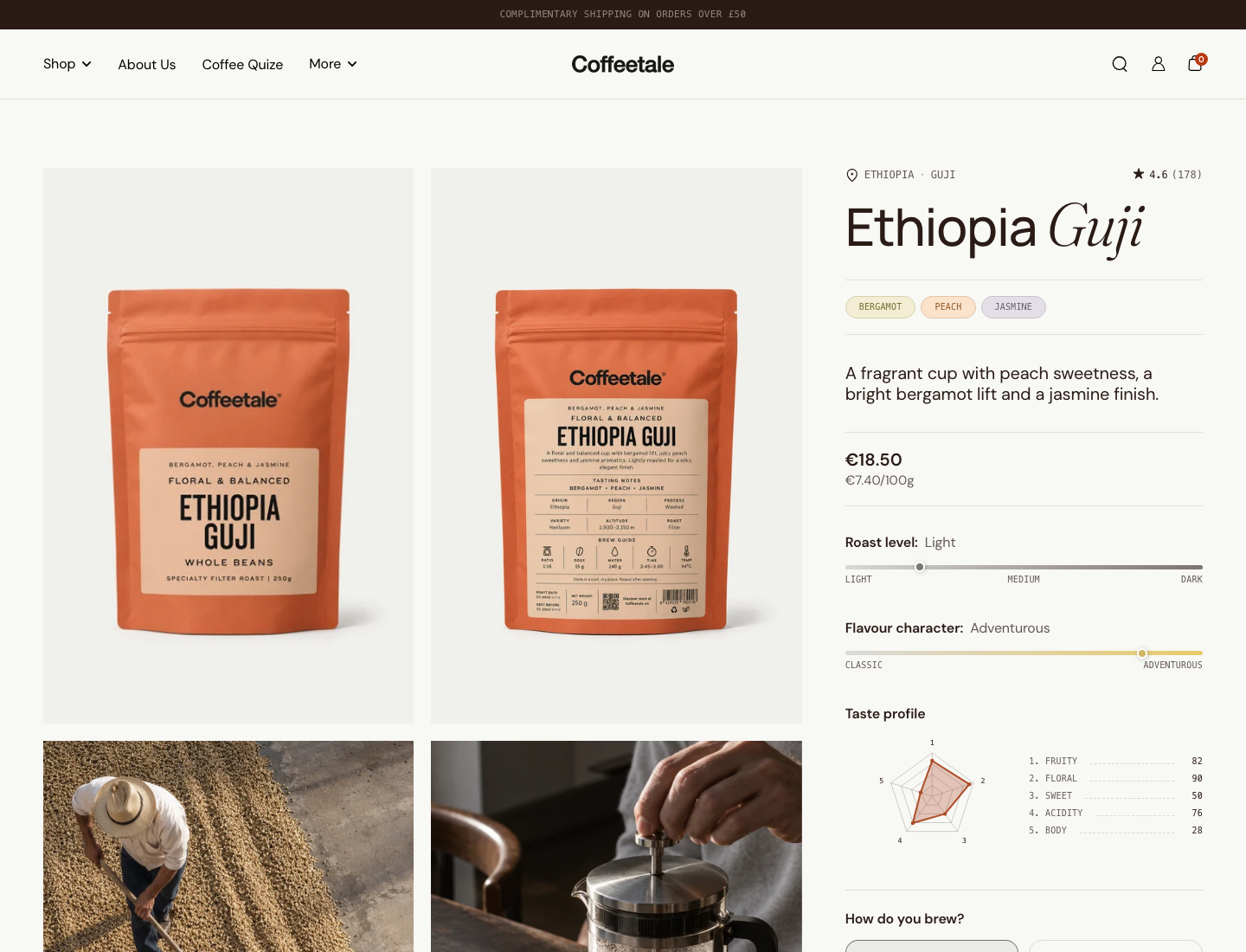
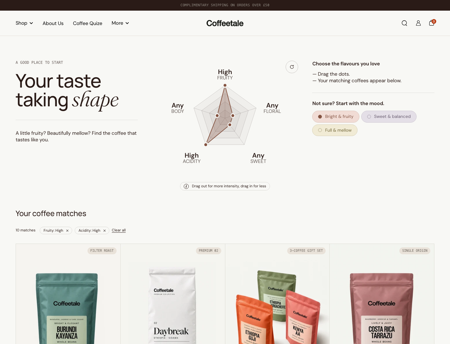
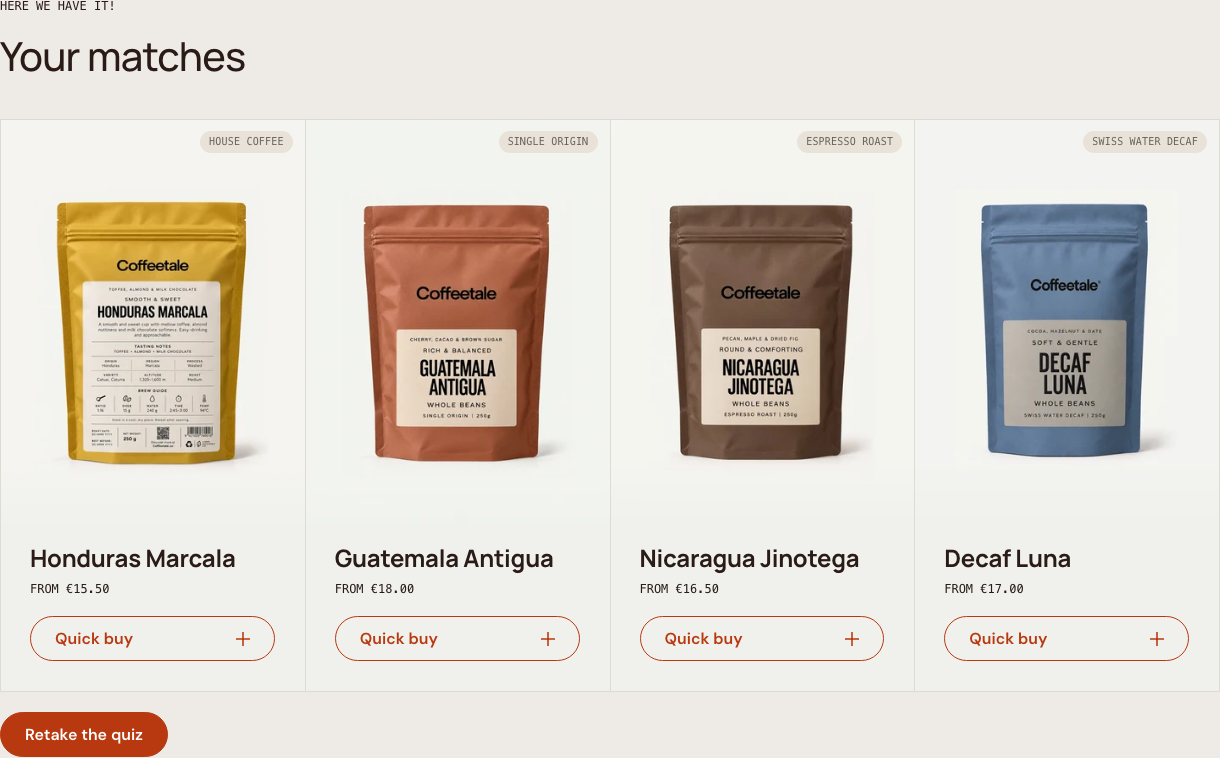
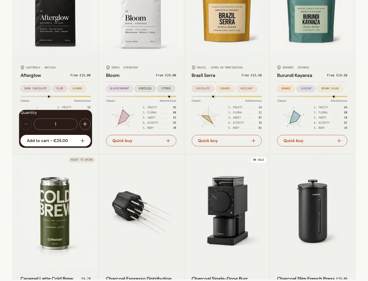
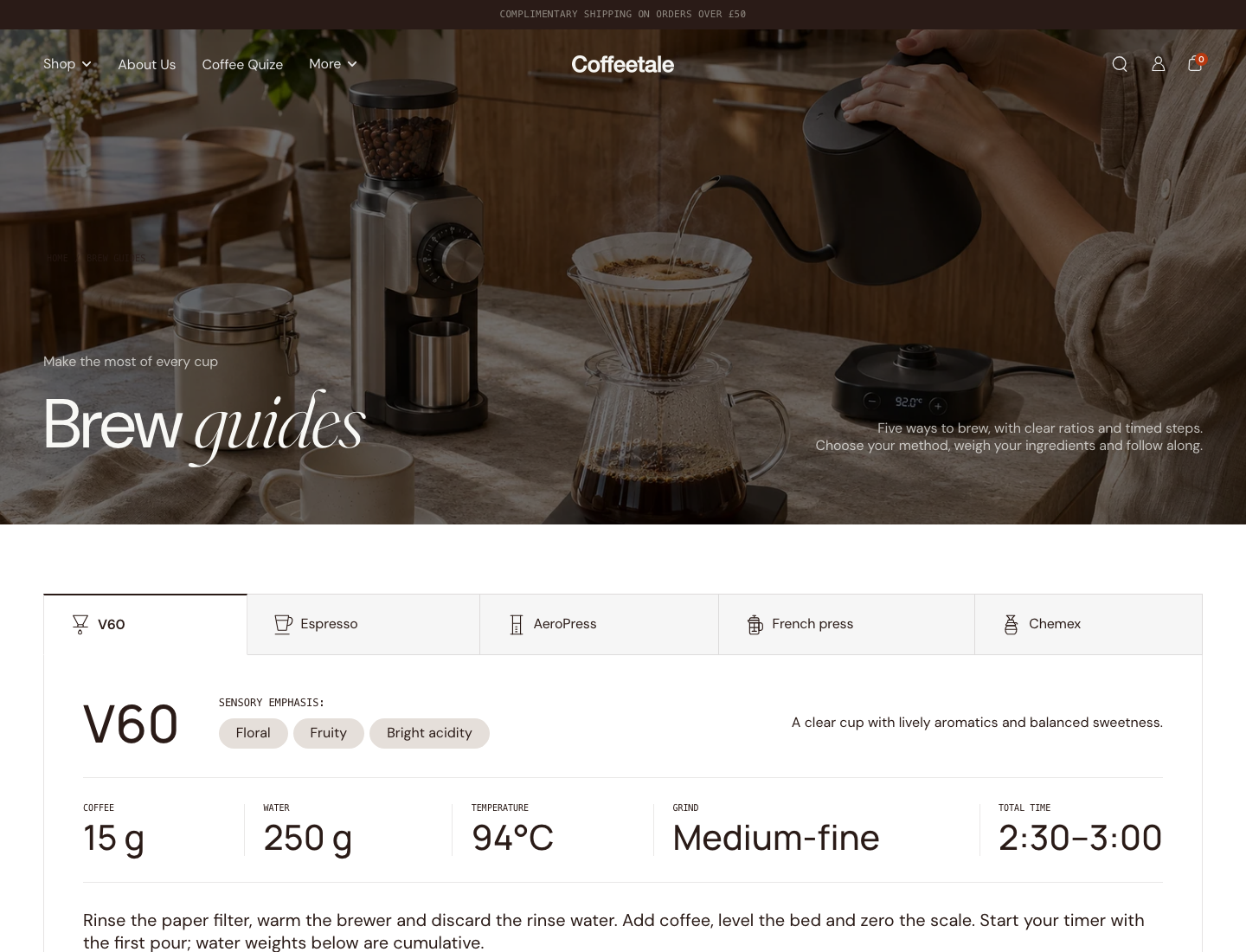
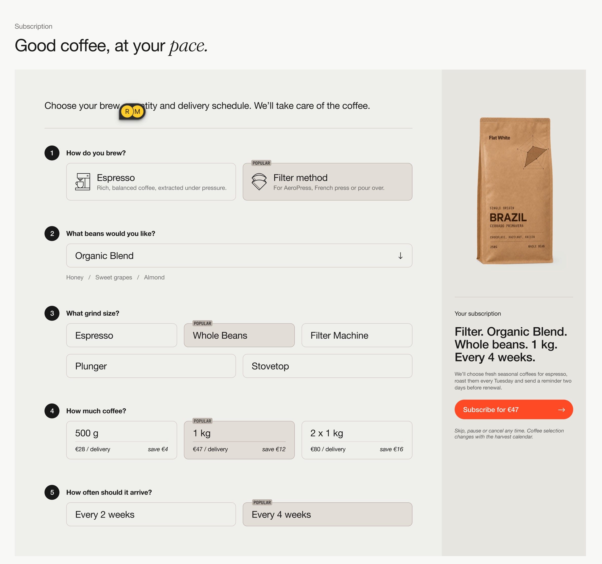
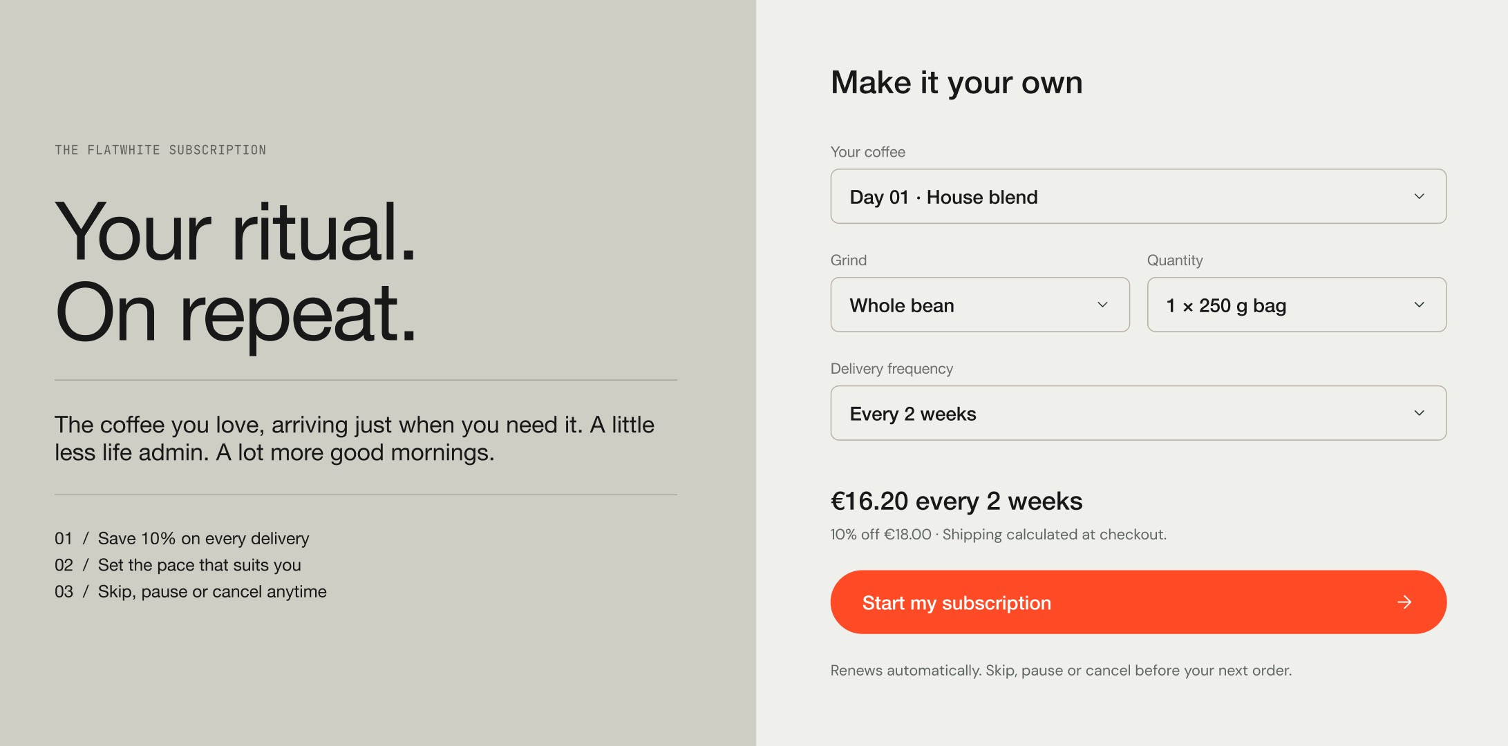
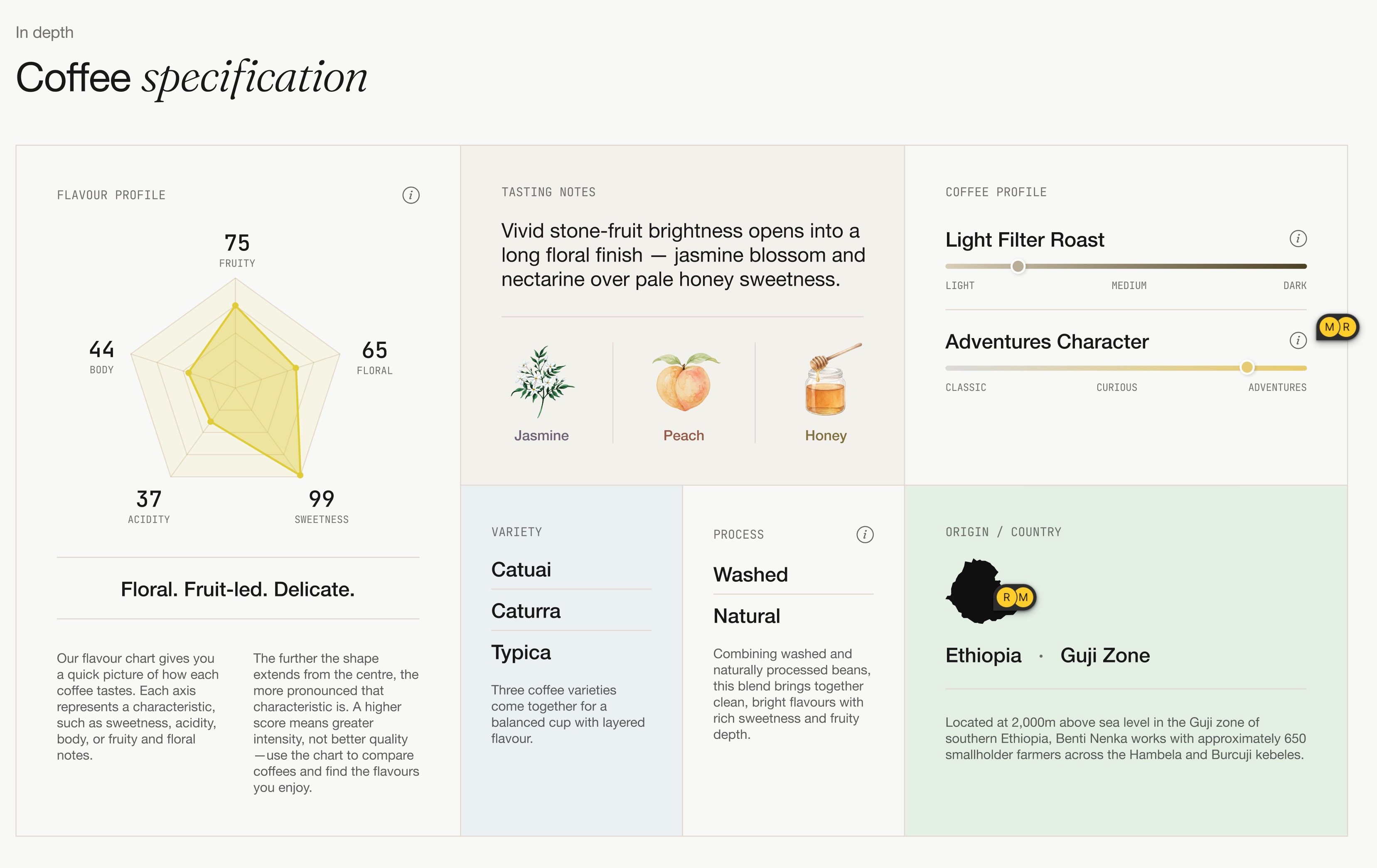
Use original images or live captures at their actual resolution. Contact sheets are inspection aids. All supplied concept screenshots and the selected subscription references were actually viewed. Do not use Mobbin screenshots as Coffee Kit product screenshots; the report cites them as structural references only.
For illustration/icon reuse, inspect existing files under LOCAL/themes/FLAT-WHITE/build/: assets/tasting-image-*.webp; snippets/icon-pack.liquid; tasting-icons.liquid; origin-flag.liquid; origin-shape.liquid. Product packshots are Shopify product media, not assumed theme assets. Preserve the supplied/live packshots. Newly invented storefront mockups must follow current Coffeetale style and be marked as proposed.
Current Coffeetale visual values
Verified from local build/config/settings_data.json; preserve semantic variables and check live captures for the actual treatment.
| Role | Value / current setting |
|---|---|
| Main surface | section_background_color: #f8f8f5 |
| Primary ink | colors.primary_text: #2a1b17 |
| Product cards | product_card_bg_color: #F0F1EC; radius var(--kt-border-radius-none) |
| Borders | colors.border: #e7e7e7 |
| Stone | colors.color1: #e9e2d9 |
| Action | colors.color2: #b83910 |
| Pale accent | colors.color3: #fff7f1 |
| Brighter data accent | colors.color4: #e95625 |
| Utility dark | colors.color5: #3e3a35 |
| Heading family | manrope_n5 |
| Body family | dm_sans_n4 |
| Emphasis | fraunces_i3, italic word in heading |
| Utility | mono, small uppercase metadata |
Use --kt-color-background, --kt-color-text, --kt-card-background, --kt-card-border-color, --kt-button-radius, the existing font-stack variables and kt-style--heading-* / kt-style--body-* roles in real theme previews. The largest heading uses the body family; smaller headings use Manrope; bodies 3/4 use utility. Flat square cards, portrait packshots, thin borders, rounded actions, warm neutrals, subdued tasting pills and restrained charts define the current direction. External-theme prototypes need scoped equivalents, not assumptions that Krown globals exist.
What the website can demonstrate
The actual code contains cards/facts/variants/quick buy/quiz/profile finder/recipe tabs, with substantial theme dependencies mapped in the evidence report. New app backend work includes import review, mappings/audit, saved offers/experiences, provider lifecycle integration or engine ownership, migration and agency contracts. Loyalty is not established in current Coffee Kit code.
A subscription screenshot does not prove a selling-plan submission. No recurring billing, renewals, checkout, portal, cross-theme compatibility, performance or mobile audit was verified. Label capabilities accordingly. Avoid fake revenue, testimonials, badges, compatibility promises, automatic sensory scores, and performance/uplift claims. Keep price/launch scope aligned with the parent synthesis.
Source: ux-website-handoff.md The complete Markdown handoff and private datasets remain in the local project. This web edition includes selected supporting visuals and scenario downloads.