Coffee Kit: UX, source assets and design handoff
Research date: 12 November 2026. Scope: source inspection, supplied screenshot review, Mobbin references and a bounded read-only Coffeetale storefront check. No theme edits, app implementation, merchant mutations, checkout, or outreach.
Product direction
Design Coffee Kit as a coherent coffee-selling workspace: bring in a coffee, review its facts, choose how it is sold, preview the complete shopper experience, and maintain that experience as the catalog changes. The north star is the founder's replacement-worthy “#1 solution for selling coffee on Shopify.” That is a positioning ambition, not a verified market claim.
The current source provides a substantial storefront foundation. It does not provide the Coffee Kit admin, extraction/review system, subscription engine, provider integrations, loyalty ledger, or agency API. The commercially meaningful product work is connecting those storefront components to a dependable shared workflow. Assisted migration by a salesperson or AI can be a legitimate onboarding route; the ongoing result should be one manageable system, with explicit ownership of data and subscription operations.
For the first wireframes, show one complete journey from source document to a sellable coffee and subscription offer. Show existing source assets accurately. Label proposed backend actions and simulated outcomes. Do not present a subscription concept screenshot as working billing.
Evidence and reproducibility
Evidence labels: Source means actual code inspected; Live means a specific browser observation; Visual means a supplied image or Mobbin image actually viewed; Proposal means a design recommendation. None of these establish conversion uplift, demand, price acceptance, or cross-theme compatibility.
Recovered the prior thread with read_thread(includeOutputs: true). Its returned history was truncated and preserved the finding about helper-section dependencies and reference candidates. The report checks those against accessible files and viewed images instead of treating the recovered commentary as complete evidence.
Read the founder brief, relevant current sections of both context dossiers, existing study notes, theme workspace rules (local handoff artifact), Coffeetale agent guide (local handoff artifact), design contract (local handoff artifact), Hydra child-theme rules and the latest available daily theme log. The actual build takes precedence over a shorthand capability description in a historical brief.
Repository snapshot, all clean at inspection:
| Repository | HEAD |
|---|---|
FLAT-WHITE/build |
9f020b1a8fe969bcdf0422b7b1234f4adc90cbd8 |
FLAT-WHITE/_dev |
3c1d83e9b636dcf15d4d6c37b8bd73f87ec368c8 |
_framework/hydra |
62fbccc5259a30a13fb23b30b3ea6b447e0b57fb |
_framework/js |
5a6c6af198e68dd561864804943649138c00b0e4 |
The source manifest (local handoff artifact) records 41 entry points, hashes, source filename candidates, direct literal dependencies and repository states. It is not a complete graph of dynamically selected blocks. The old .source-map.json predates this study; its mapping was not treated as current proof. The inventory script (local handoff artifact) reads source and produces contact sheets without modifying themes. It requires Pillow; the research run used an isolated temporary Python environment.
All 14 Coffeetale concept images and 21 representative supplied subscription screenshots were viewed in seven generated contact sheets. The screenshot manifest (local handoff artifact) identifies every original, dimensions and contact-sheet cell. Fine copy and transactional behavior are not inferred from thumbnail-sized text. Mobbin references below were also actually viewed; nine useful full-resolution files were downloaded to the reference folder (local handoff artifact).
Live check and its boundary
Used the existing local Playwright runtime and cached Chromium. The installed runtime initially expected a newer uncached browser; explicitly selecting cached Chromium 1248 resolved that. The password was used only to open a storefront session. The inspection script (local handoff artifact), browser observations (local handoff artifact), and captured screenshots (local handoff artifact) are retained.
| Surface | Actual observation |
|---|---|
| Homepage | HTTP 200; coffee cards, tasting notes, scales and charts rendered. A quiz-creator element is present. |
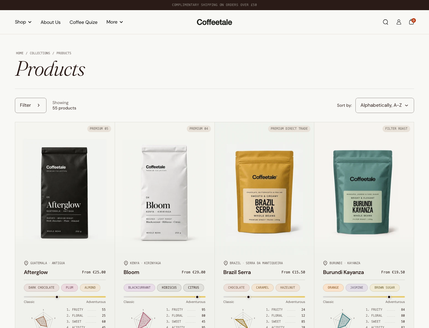
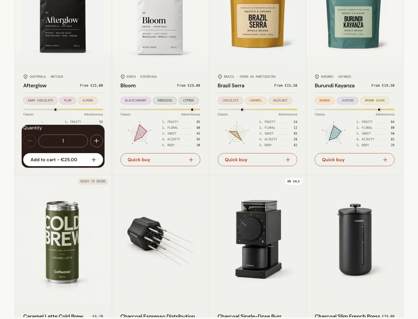
| Collection | HTTP 200; 55 products in this demo collection. Opened a multi-variant quick-buy trigger and waited for its helper-backed product-variant element to become visible. Captured the open quantity/add-to-cart panel. Did not submit. |
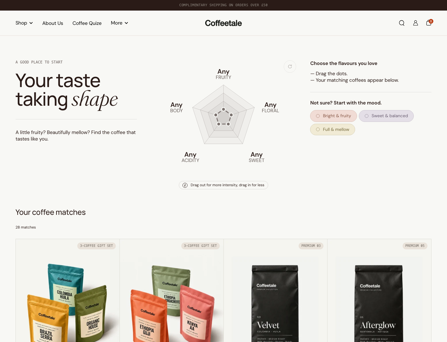
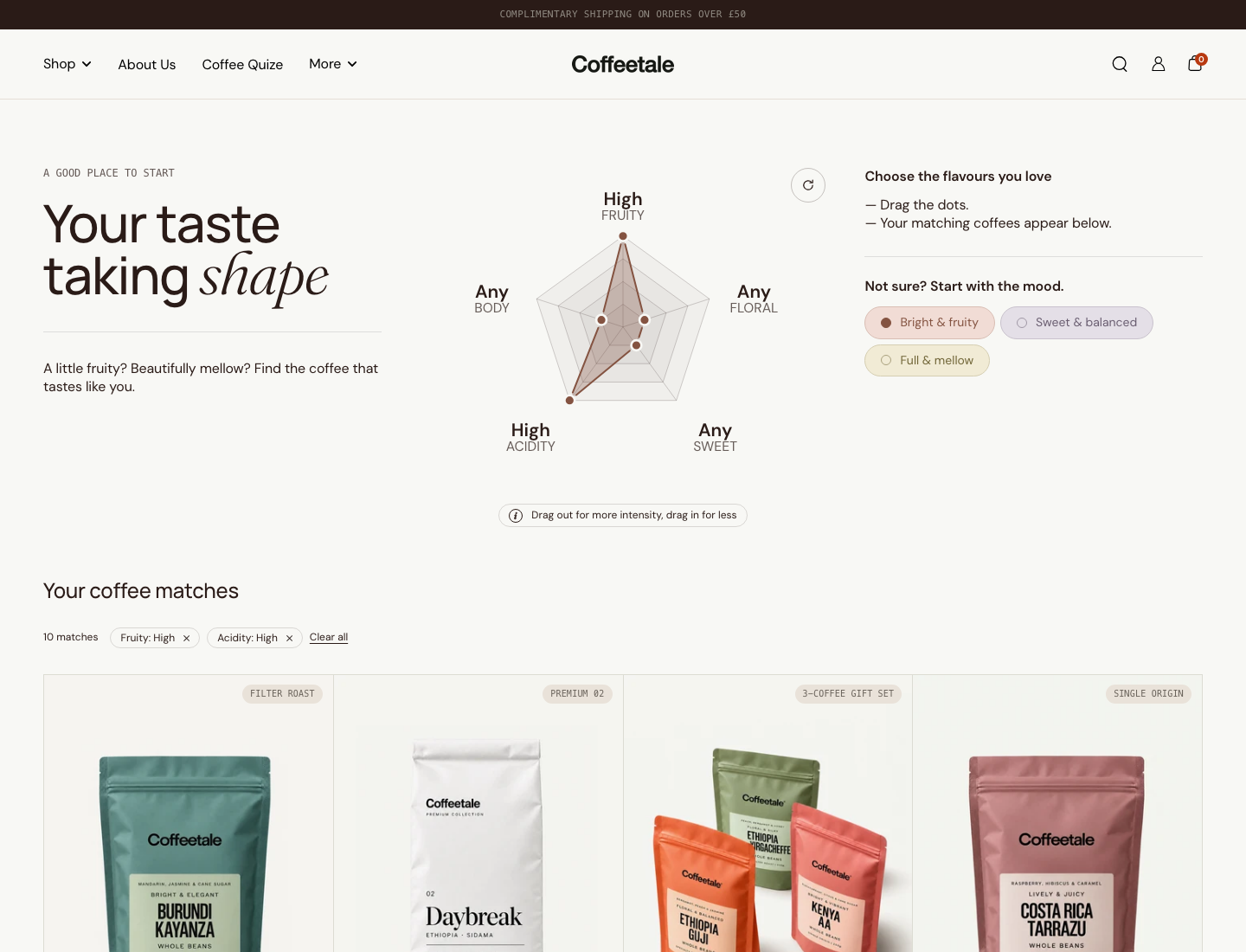
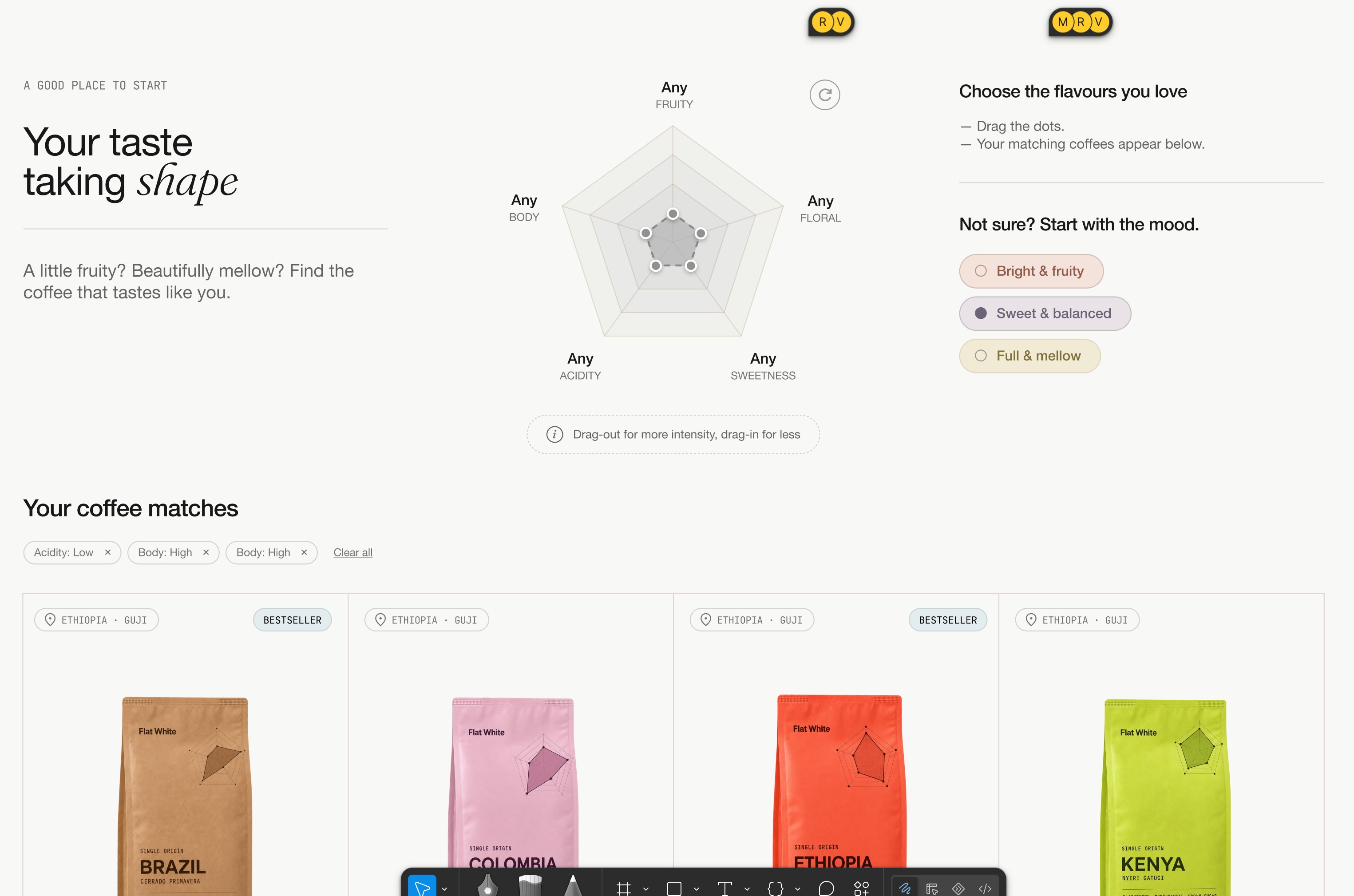
| Profile finder | HTTP 200; initial text reported 28 matches. Clicking “Bright & fruity” selected high fruity/high acidity, showed matching filter pills and reported 10 matches. Cards refreshed. These are demo observations, not an accuracy benchmark. |
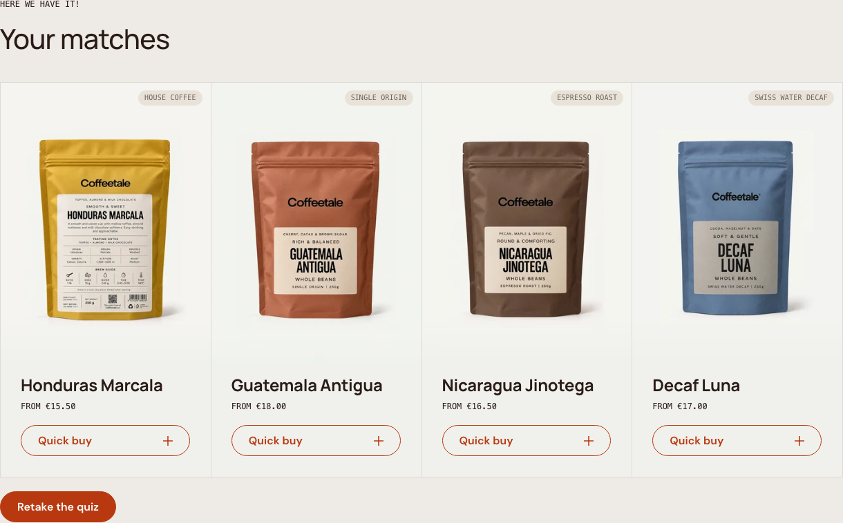
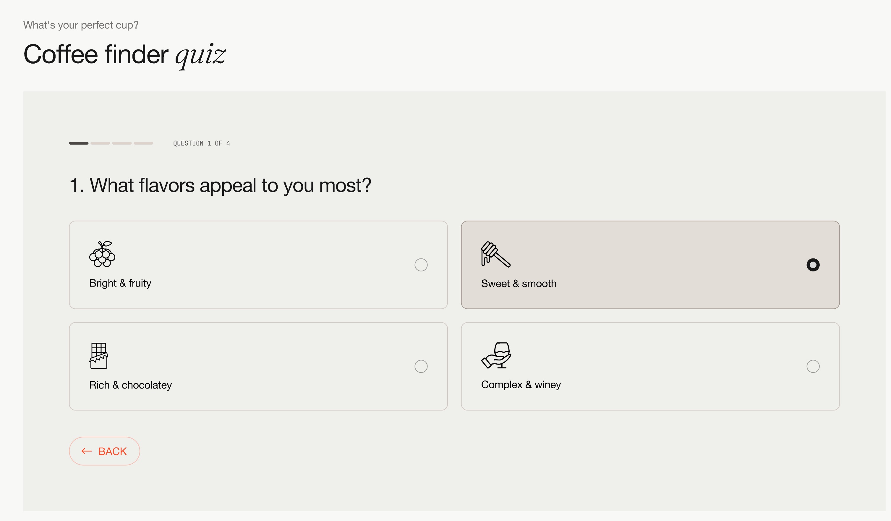
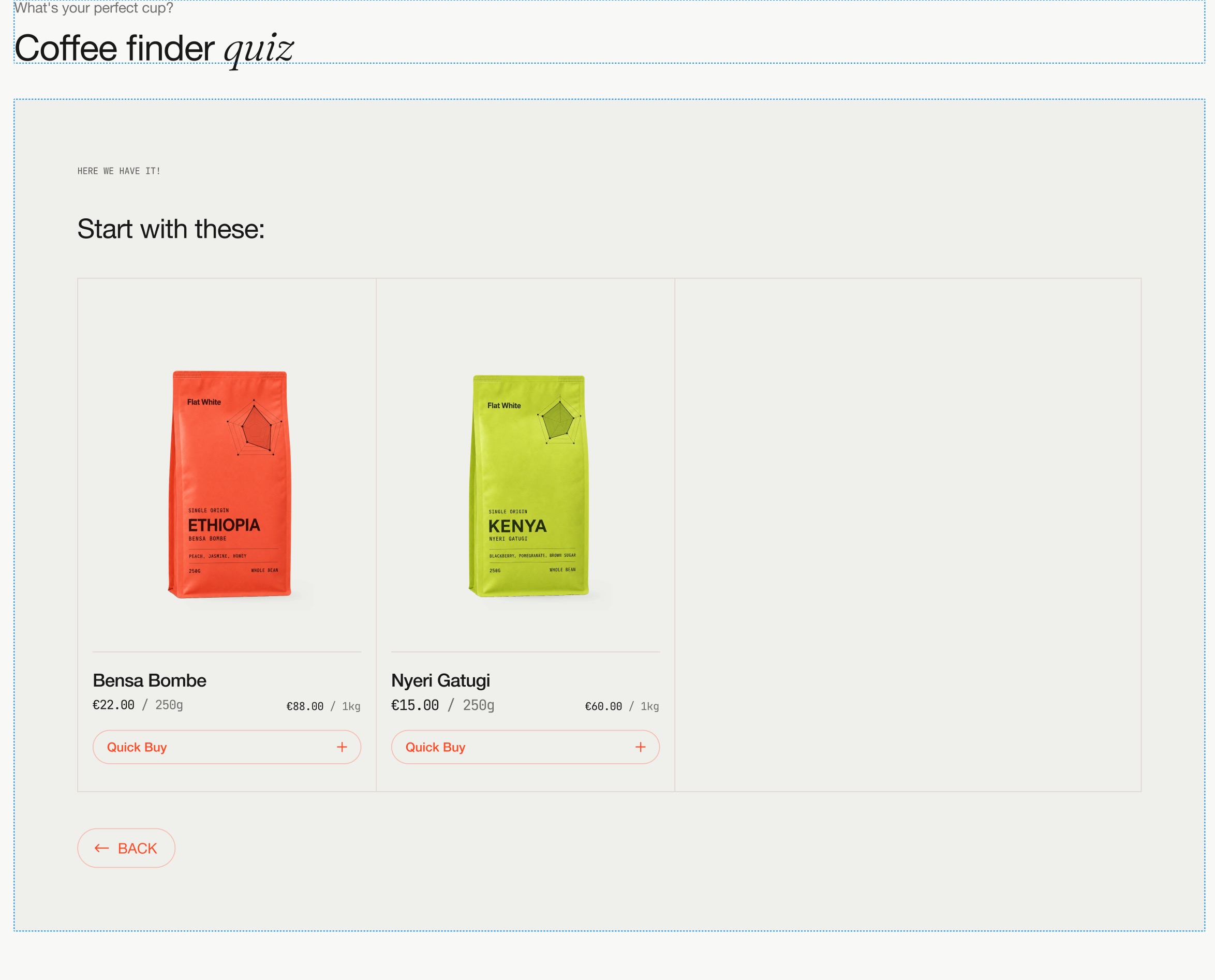
| Coffee quiz | HTTP 200; selected the first answer in each of four questions: espresso machine, black coffee, rich/chocolatey, light/bright. The result rendered four cards: Honduras Marcala, Guatemala Antigua, Nicaragua Jinotega and Decaf Luna. This verifies one completed path, not recommendation accuracy. |
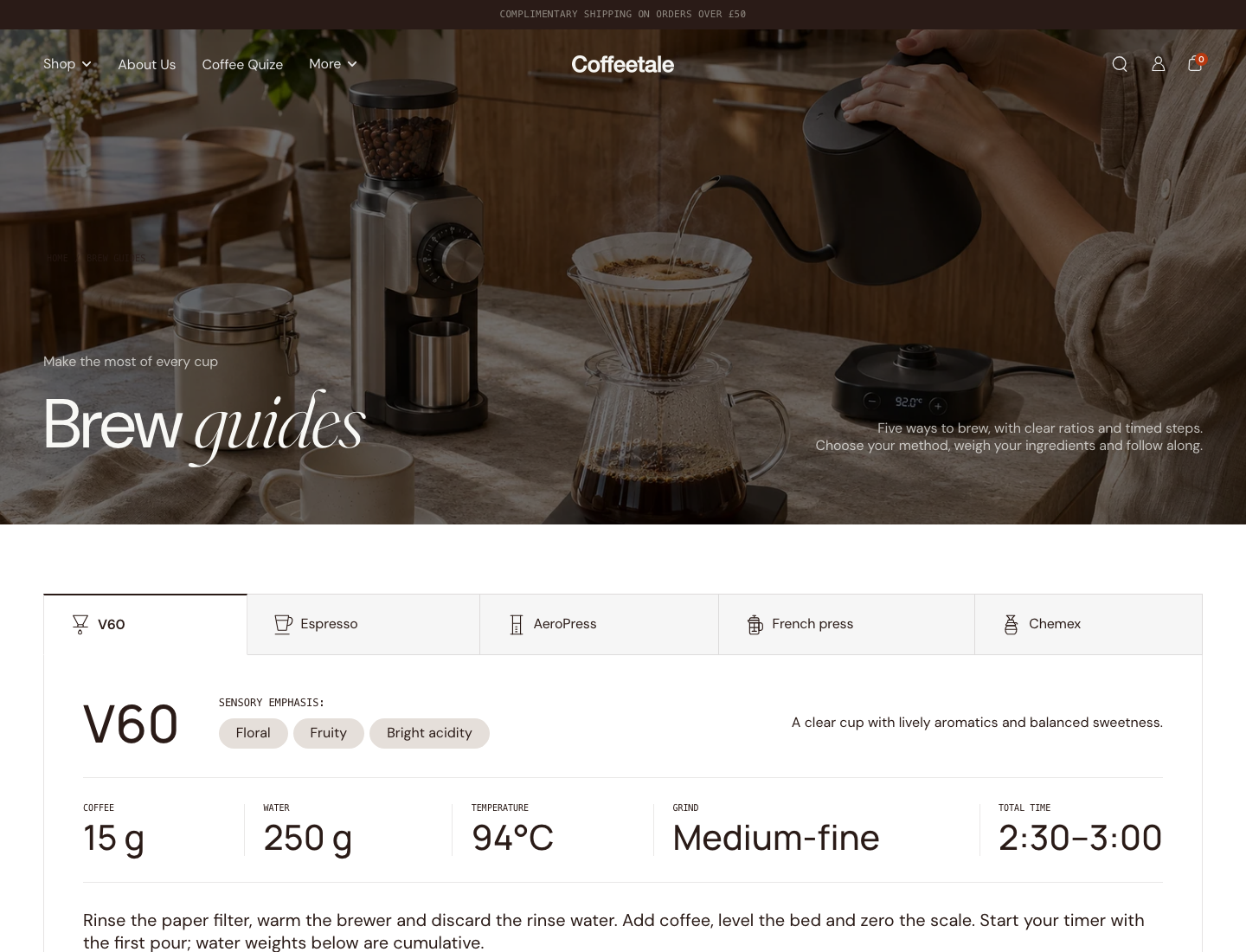
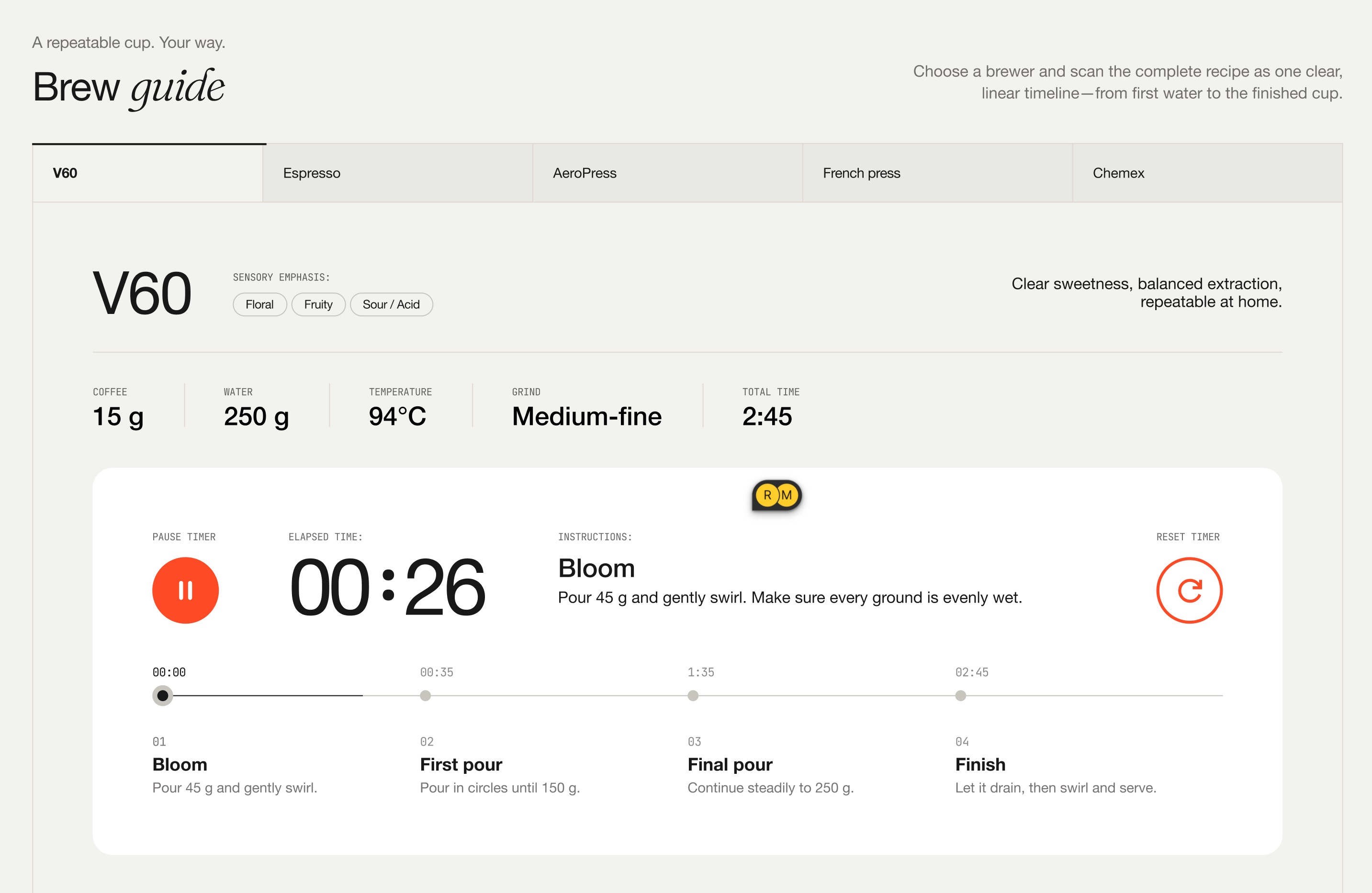
| Brew guides | HTTP 200; method tabs and V60 recipe specifications rendered. Screenshot shows 15 g coffee, 250 g water, 94°C and medium-fine grind. |
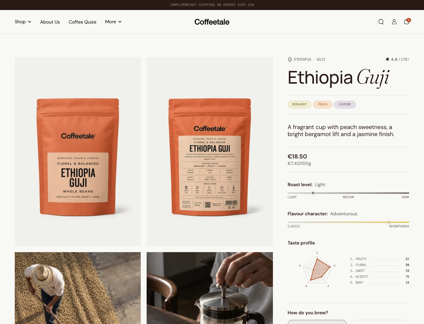
| Ethiopia Guji PDP | HTTP 200; notes, roast/character scales, five profile axes, brew/grind and bag-size controls rendered. The inspected DOM contained no name="selling_plan" input. |
The guessed /pages/quiz and /pages/brew-guide routes returned 404. The actual navigation uses the longer routes above; those 404s are not evidence of missing quiz or brew-guide functionality. No cart-add, payment, checkout, renewal, portal management, admin editing, accessibility audit, performance benchmark, mobile QA or external-theme installation was performed. Lack of a selling-plan input on these pages does not prove that the store has no subscription app elsewhere.
Useful live captures for the website: collection, profile finder, selected mood, open quick buy, brew guides, PDP, and completed quiz. Page captures use a 1440 × 1100 viewport; the quiz-result capture is cropped to its actual component. Crop for presentation without claiming to show untested commerce.
Existing code versus product work still needed
Paths below are relative to LOCAL/themes/FLAT-WHITE/build/ unless another root is given. Build files are evidence of delivered output, not files to edit. Future implementation belongs in the child _dev or the owning framework source.
| Capability | Actual source evidence | What is reusable | Coffee Kit work still needed |
|---|---|---|---|
| Coffee product card | card block (local handoff artifact), snippets/card.liquid, assets/component-product-card.css |
Composable card surface and child blocks; image, badges, origin, notes, scale/chart and quick-buy treatments | Catalog eligibility, app-owned grid/result surfaces, saved style configuration, adapter for selected native grids, measured installation behavior |
| Coffee facts | tasting notes (local handoff artifact), tasting-images, origin-icon, flavor-chart, progress-bar |
Source-aware renderers, native SVG charts, country maps/flags, illustrative tasting assets | Canonical mapping, provenance/review, completeness rules, scale definitions and conflict handling |
| Brew/grind and bag size | variant block (local handoff artifact), option renderer (local handoff artifact) | Existing options represented as icon/card/pill controls, availability hooks, prices/unit prices | Merchant-friendly option mapping across catalogs/locales, subscription eligibility and full variant/plan synchronization |
| Quick buy | popover (local handoff artifact), helper (local handoff artifact), assets/component-quick-buy-popover.js |
Deferred body fetch, quantity controls, dialog lifecycle, single-variant direct-add branch | Portable rendering route, own cart contract, provider selling-plan UI and external-theme cart adapter |
| Quiz | quiz card (local handoff artifact), answer mapping (local handoff artifact), assets/component-quiz.js, result helpers |
Questions, progress, product or tag mappings, ranking, result cards, empty/error states | Admin authoring, catalog-driven suggestions with review, explanation of fallback matches, versioned publishing and ongoing eligibility checks |
| Profile finder | section (local handoff artifact), chart data (local handoff artifact), component-chart-filter.js, component-profile-finder.js |
Interactive axis controls, mood presets, active filters, exact/closest results and shared cards | Guided axis mapping, complete-data eligibility, catalog-size handling, simple non-chart selection and app authoring |
| Brew guide | methods (local handoff artifact), recipe (local handoff artifact), step (local handoff artifact) | Method tabs, seven label/value recipe slots, descriptions and time-labelled steps | Recipe data/review and product association; dedicated elapsed timer shown in Figma is additional work |
| Subscription builder | Four supplied concept screenshots; cart plan-name rendering (local handoff artifact) | Visual layout direction; existing card/option controls are useful ingredients. Cart can display a line's existing selling-plan name | Builder configuration, eligible variants/plans, pricing, cart submission, provider integration or owned engine, lifecycle/portal, substitutions and recurring-stock responsibility |
| Import/review admin | No Coffee Kit implementation found in inspected workspace | Domain conventions and existing fields can seed the specification | File processing, extraction, field-level source links, import queue, draft changes, retry, audit, read-back and conflict-aware undo |
| Loyalty and email | No Coffee Kit implementation established | Some generic theme forms/content may provide visual surfaces | Choose provider/integration contract or build a ledger and lifecycle. Neither should be described as existing Coffee Kit functionality |
| Agency/backend-only use | No Coffee Kit public API established | Shopify data/rendering conventions | Authenticated versioned configuration and matching APIs, documented contracts, exports and compatibility policy |
“Implemented in source” and “verified live” remain separate. For example, a dialog's focus-handling code exists, but this study did not complete keyboard or assistive-technology testing.
Exact dependency map and portability implications
Shared presentation and commerce
The theme shell (local handoff artifact) renders head-variables, loads theme CSS and supplies shared assets. Head variables (local handoff artifact) supplies the product-form script registry entry, routes, settings, typography and CSS variables. Components call window.KROWN.loadScript or loadScripts. This is an actual runtime dependency.
Product card block
  -> content_for blocks (merchant composition)
  -> card snippet -> color tokens, language direction, image/video helpers
  -> product-card CSS + global typography/layout/token CSS
  -> child origin / notes / scale / chart / price / quick-buy blocks

Quick-buy block
  -> quick-buy-popover snippet
  -> component-quick-buy-popover.js (loaded once by theme.liquid)
  -> GET product URL ?section_id=helper-quick-buy
  -> helper-quick-buy -> product-variant-options
  -> product-variants + product-form + quantity-selector custom elements
  -> GET helper-product-variant when options change
  -> shared component-product-form.js
  -> Shopify cart endpoint + Krown cart refresh/drawer events
The quick-buy script (local handoff artifact) caches fetched helper bodies, preloads in-view cards under favorable connection conditions and loads shared scripts. It also uses Krown settings/events to show the cart sidebar. A single-variant product takes the direct form branch; a multi-variant product opens the helper-backed panel. Neither branch by itself selects a subscription plan.
The shared product-form source (local handoff artifact) serializes the form, posts to the configured cart URL and requests cart helper sections where appropriate. Variant changes use Krown events and helper rendering. Do not extract only the visible buttons and assume these behaviors travel with them.
Finder and quiz
Quiz section -> _quiz-card -> intro, progress, questions/answers, results view
  -> component-quiz.js
  -> tag route -> quiz-results-ids (first 50 products)
  -> ranked IDs -> search route -> quiz-results (first 24 results)
  -> quiz-product-card -> image, video, badges, price, card, quick-buy-popover
  -> quick-buy dependency chain above

Profile-finder section
  -> _profile-finder reads selected collection + numeric metafield keys
  -> radar-chart SVG + JSON product vectors
  -> component-chart-filter.js + component-profile-finder.js
  -> exact level matches, otherwise nearest profiles
  -> search route ?section_id=quiz-results&type=product&q=id:...
  -> quiz-product-card and quick-buy dependency chains
Source correction: the agent guide describes tag matching as AND across questions/OR within a question. Actual code supports both explicit product mappings and tags, configurable AND/OR behavior, and a closest-match fallback. In the ranking function (local handoff artifact), AND keeps the IDs matching the greatest number of questions; if no product matches every question, partial matches can remain. The UI must distinguish “matches all your choices” from “closest available.” Do not advertise strict filtering without reconciling this behavior.
The tag ID helper paginates by 50 (local handoff artifact); the result renderer paginates by 24 (local handoff artifact). This is a bounded candidate set, not proof of catalog-wide exhaustive ranking. Unknown-tag handling checks the tags Shopify actually applied so that an invalid tag does not silently become an unfiltered result.
The profile finder reads up to a 250-product page (local handoff artifact), requires at least three configured axes, skips a product missing any selected numeric axis, and clamps numbers to the configured range. It accepts direct namespace.key and one nested metaobject-field path. It does not create the source values. The JS tries exact categorical levels before distance fallback (local handoff artifact). Source has separate empty, error and closest-match UI. An import tool must not invent scores to make more products eligible.
Recipe presentation
Brew-guide section -> _brew-methods -> _brew-method -> _brew-step
  -> tabs component + tabs/brew-guide/timeline CSS
  -> theme typography, color tokens and icons
The methods parent (local handoff artifact) loads component-tabs. The step block prints the supplied time/title/text. No dedicated elapsed brew timer, pause/reset controller or automatic step progression was established in the inspected recipe code. Generic countdown blocks elsewhere do not prove that the Figma stopwatch exists.
Delivery decision
Proposal: retain two supported delivery modes behind one experience configuration: compatible Coffeetale reuses its native components through an explicit version/capability contract; another supported theme gets scoped Coffee Kit renderers and its own minimal runtime. The same coffee, matching rules and offer should survive a presentation change.
Theme app extensions provide blocks, embeds, snippets and assets. They do not package arbitrary theme helper sections as though they already existed in every host. Replacing every native product card is also a separate adapter problem. Use app-owned grids, quiz results and subscription-builder surfaces as the first reliable card placements. Shopify extension structure and constraints.
The current helper URL architecture needs deliberate replacement or a tested supported-theme dependency. Section Rendering renders existing theme sections and cannot receive arbitrary new setting values. A proposed portable renderer must specify where the markup comes from and how selected variant, availability, price and plan stay authoritative. Shopify Section Rendering API.
Actual data bindings to preserve
The agent guide describes standard attribute support; the checked demo templates demonstrate richer custom bindings. Do not collapse these into a single unverified schema.
| Consumer | Actual checked binding | Consequence for migration |
|---|---|---|
| PDP origin | custom.farm reference, then country, region; optional custom.secondary_farm |
Preserve blends/multiple origins. Do not force one farm per product. |
| Notes | custom.coffee reference, then tasting_notes; passed through metafield_tag |
Preserve list/reference typing and displayed vocabulary. |
| Roast/character | custom.coffee.roast_label, roast_attribute, character_label, profile_attribute through reference dereferencing |
A label and number are distinct fields. Do not infer precise numbers from labels. |
| Sensory axes | custom.fruity, custom.floral, custom.sweet, custom.acidity, custom.body |
Current demo's first five axes use direct product numeric metafields. |
| Profile finder | Same five keys, shape: 5, max_value: 100, collection handle coffee |
Axis labels/scale/order and eligible collection must be explicit shared configuration. Additional axis settings exist but are inactive at shape five. |
| Other specifications | custom.coffee variety/process/story/harvest; farm washing station/altitude |
General content and coffee entities need mapping, not only charts. |
| Cost transparency | custom.coffee.cost_breakdown nested reference; some homepage bindings name a coffee_cost_breakdown record directly |
Optional, source-backed transparency content. Never infer merchant margins or imply every merchant needs this model. |
Direct examples: PDP template (local handoff artifact), profile-finder template (local handoff artifact), homepage card (local handoff artifact). These store-specific templates contain bindings even though the distribution guide says shipping presets should omit store bindings. Treat them as inspected demo configuration, not universal installation defaults.
Source renderers also support shopify.flavor and shopify.country through product-metafield-values. Audit existing definitions and offer “use existing,” “copy once,” or “managed mapping” with a conflict policy. The proposed coffee_kit namespace in the data study is not the existing Coffeetale schema. Refer to data/discoverability report for ownership and persistence decisions; data accessibility and continued operation of paid UI after uninstall are separate promises.
Viewed supplied visuals
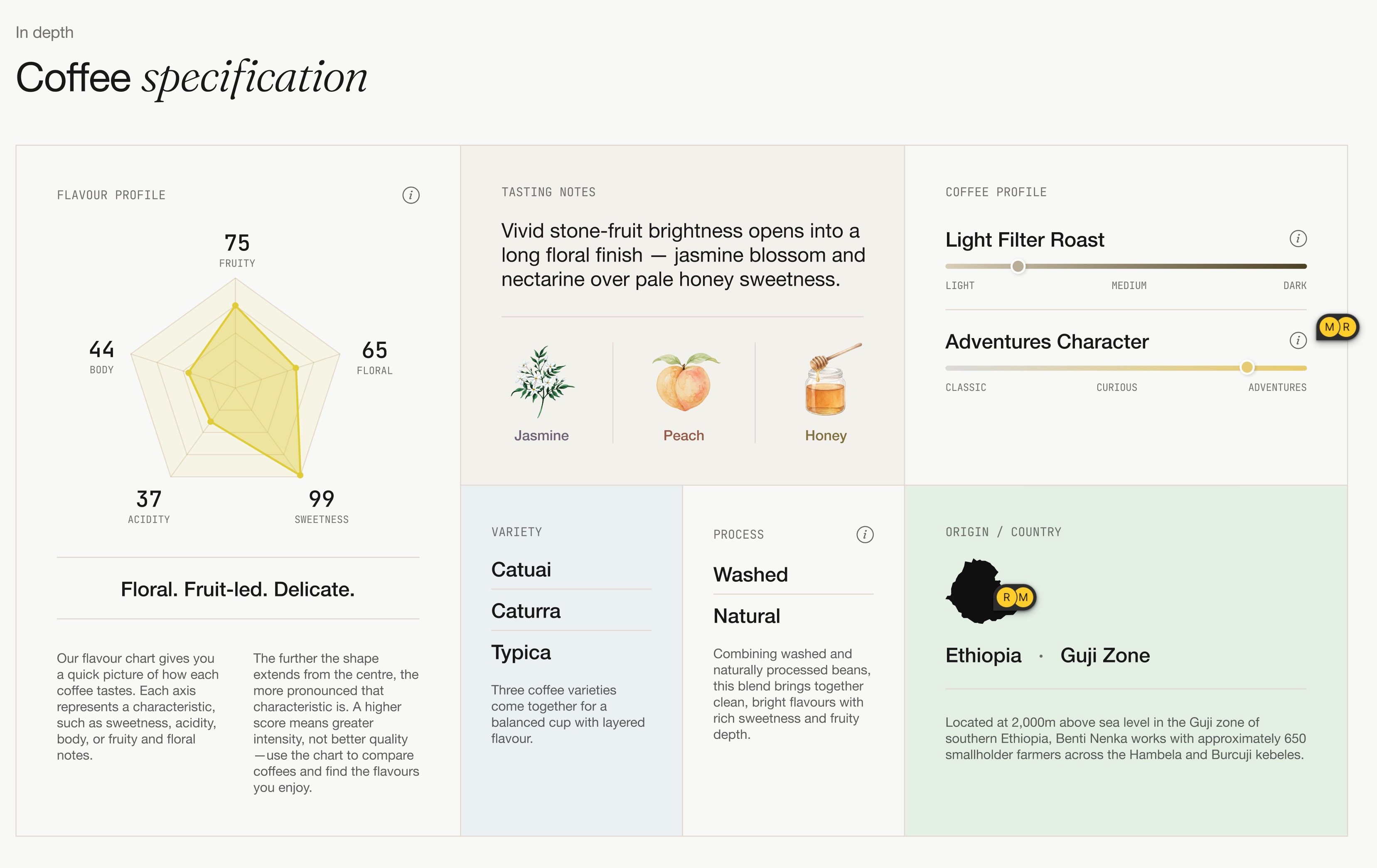
The screenshots contain design comments and sample data. Use them for layout and design provenance, with captions. They are not evidence of subscriptions being charged or recipes/data being verified.
| Original image | What was visibly established | Recommended use |
|---|---|---|
| Coffee specification | Radar/profile, tasting illustrations, scales, origin and process in one band | Reference for a rich coffee PDP and preview, with actual source-backed values |
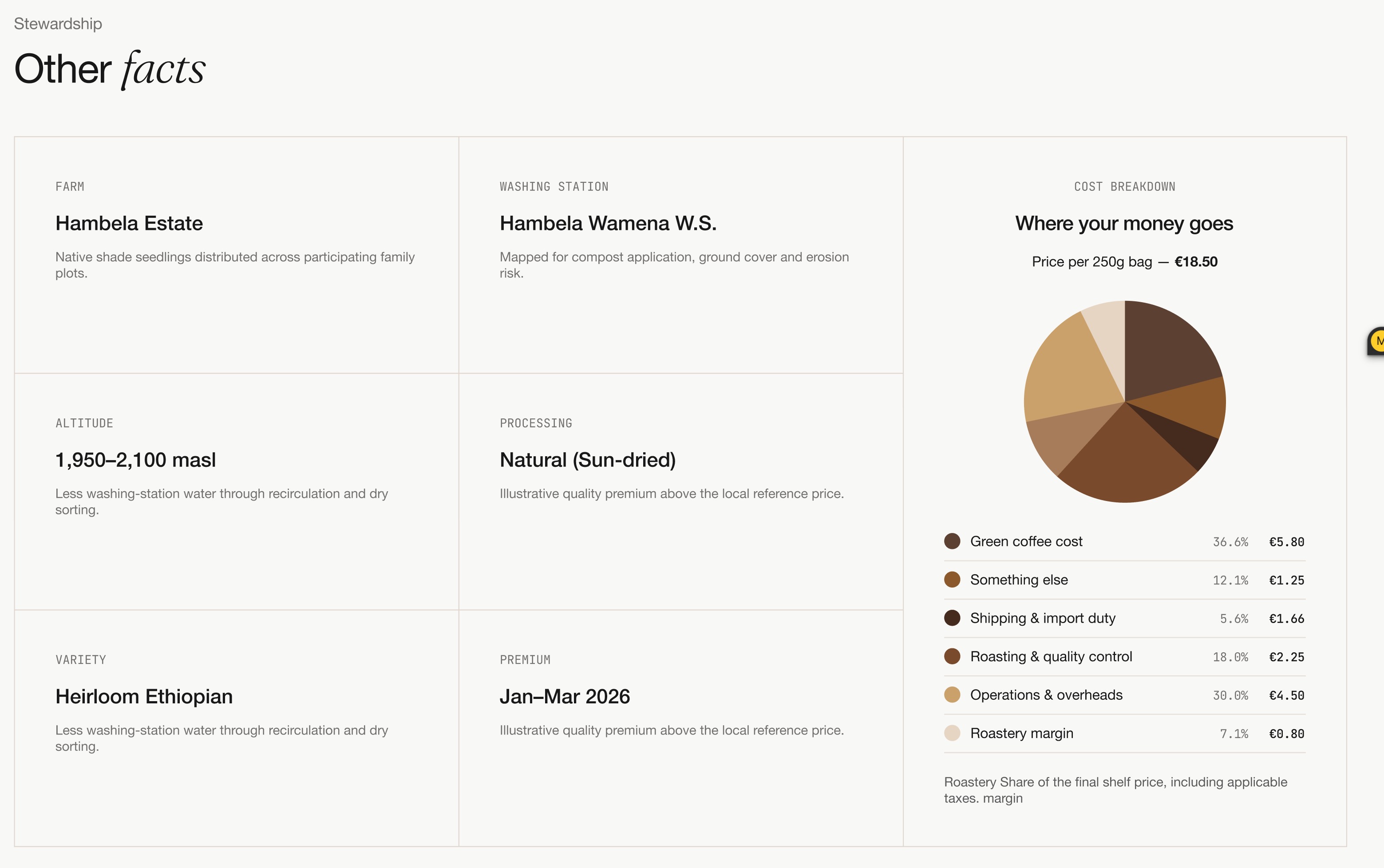
| Other facts | Farm/station/altitude/harvest and a cost-breakdown chart | Optional deeper story module; illustrative cost data must stay labeled |
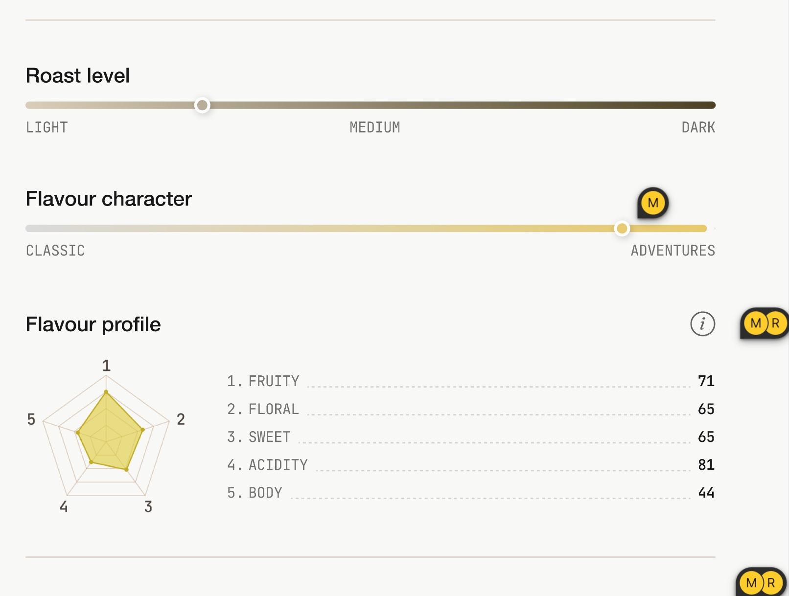
| Scales and profile | Roast/character scales plus a numerical profile legend | Compact facts module and source-review preview |
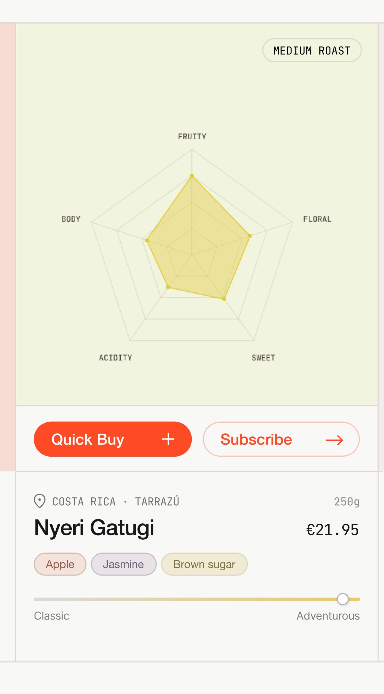
| Card front | Notes/profile and separate quick-buy/subscribe actions | Visual concept; use the live card to evidence current functionality |
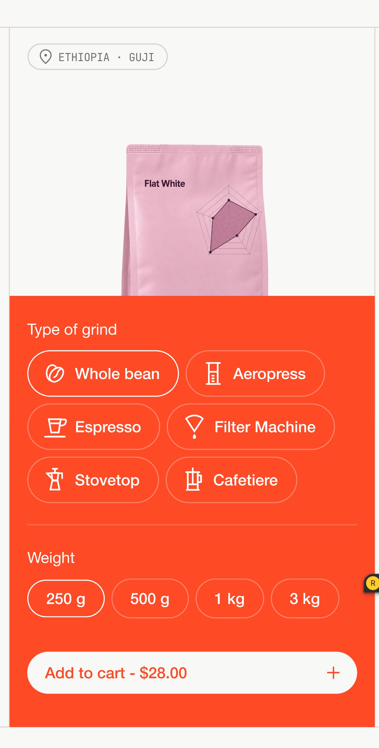
| Card quick buy | Grind and weight choices in a colored panel | Purchase-panel direction; live panel has a different current treatment |
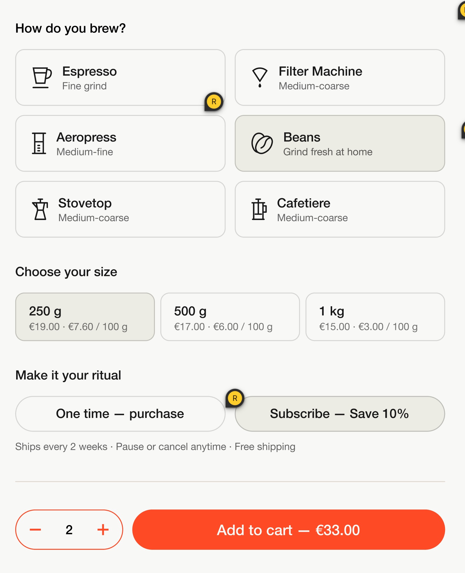
| Variant selector | Icon grind cards, bag sizes, one-time/subscribe choice, quantity and total | Proposed integrated purchase UI; subscription choice is not established in current source |
| Quiz question and results | Taste tiles, progress, returned cards and quick buy | Existing guided-discovery visual language |
| Profile finder | Interactive-chart direction, mood shortcuts, active filters and cards | Optional exploration route; live screenshots now also substantiate the mood interaction |
| Inline subscription | Five choices and persistent image/summary | Primary proposed shopper layout |
| Subscription step | Five-step navigation and brew-method cards | Progressive presentation for narrow/mobile contexts |
| Simple subscription | A compact product/grind/quantity/frequency form | Short path for someone who already knows their coffee |
| Split subscription | A guided step with editorial box photography | Marketing/education variant of the same configuration |
| Timed brew concept | Elapsed timer, pause/reset and highlighted instruction | Clearly label as proposed timer enhancement; current recipe tabs are reusable |
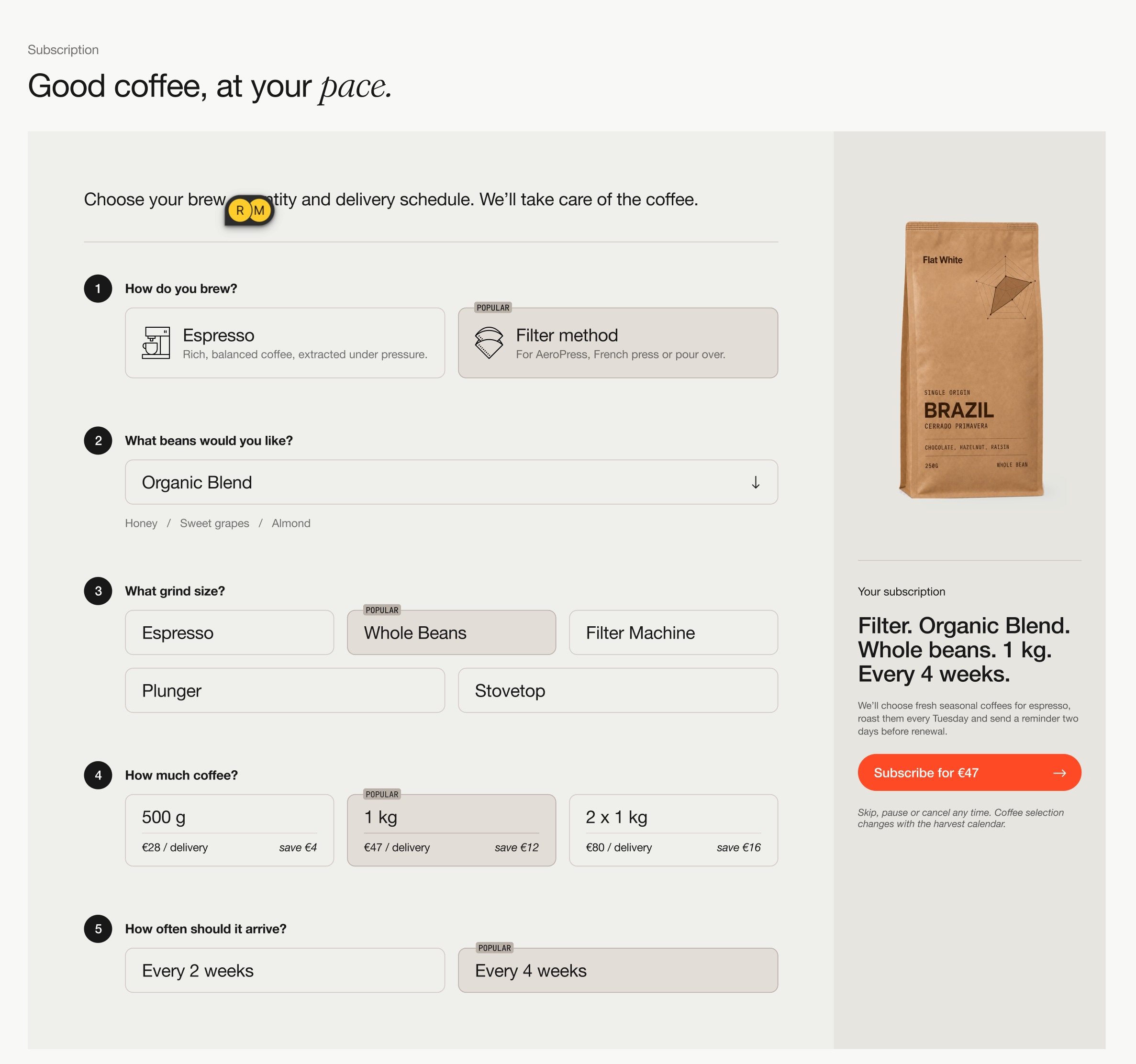
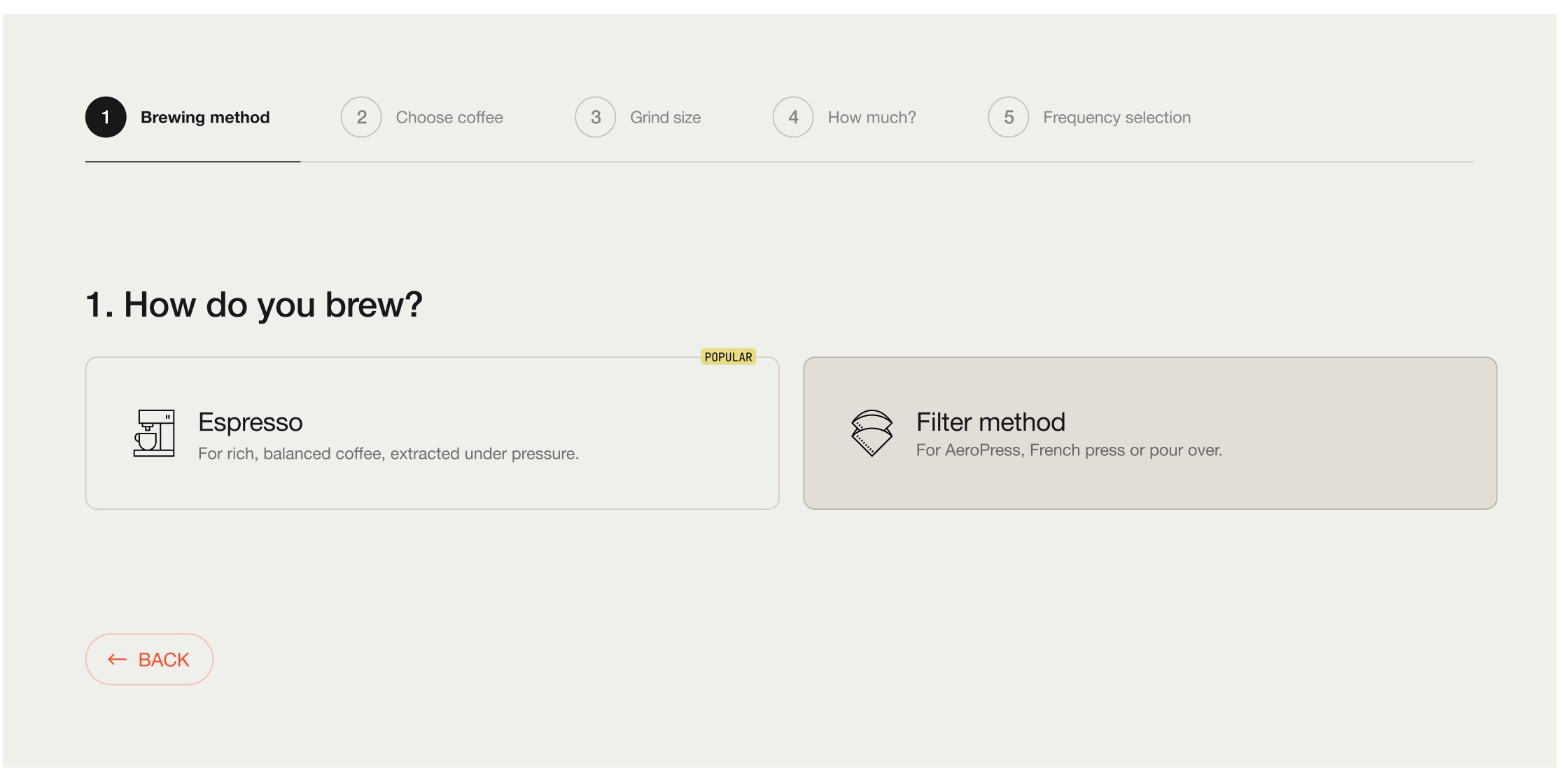
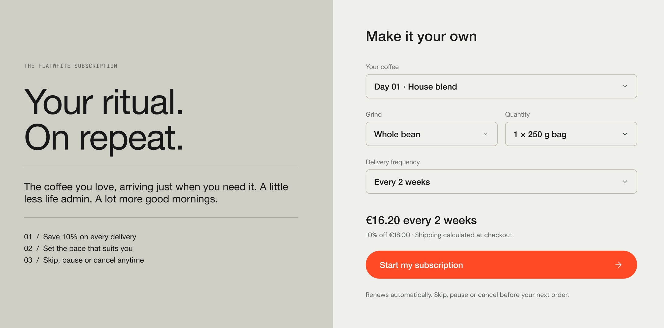
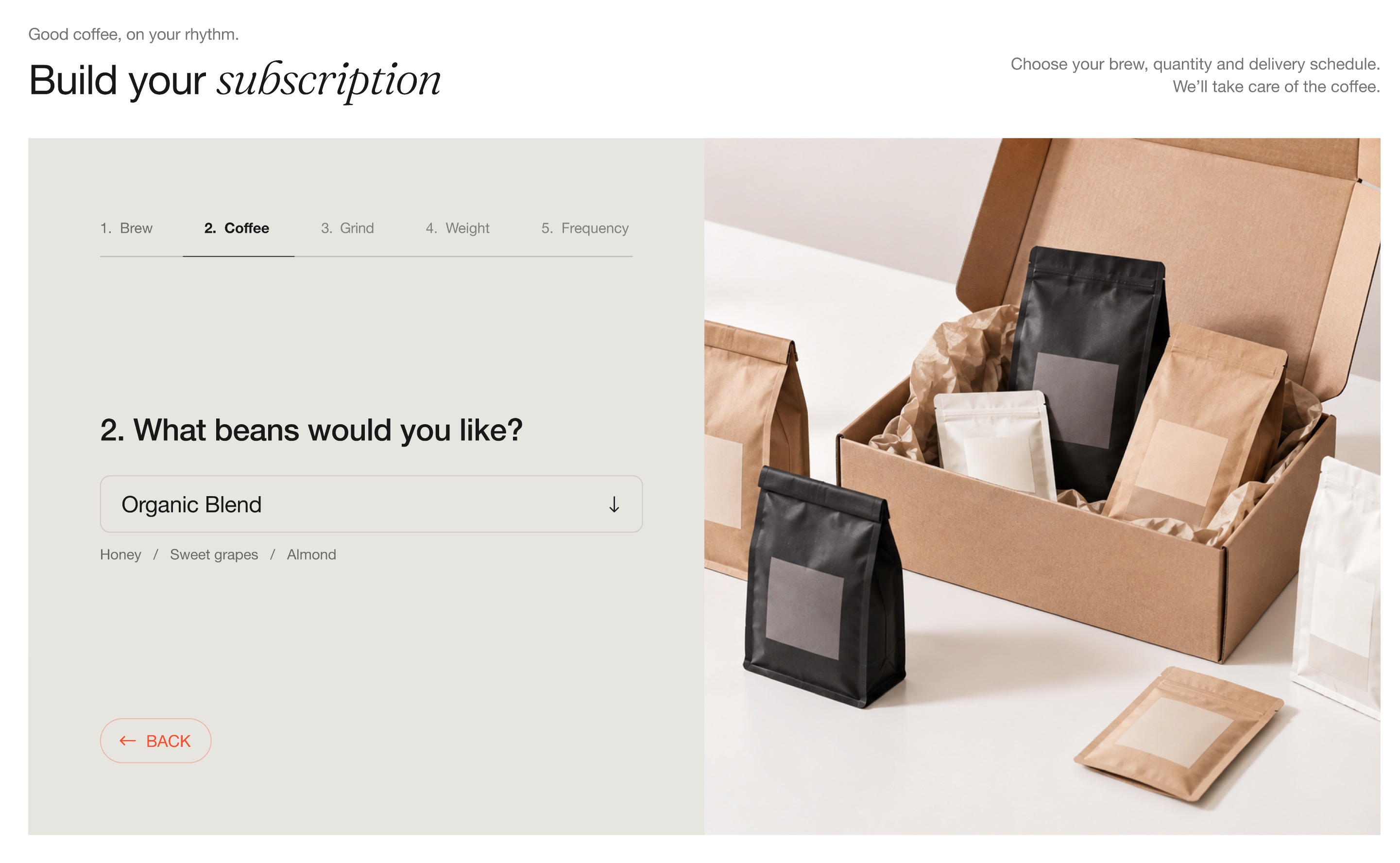
Supplied roaster subscription references
These observations come from the supplied screenshots, not fresh tests of those brands. Exact originals are indexed in the screenshot manifest. Representative endpoints were viewed for all 14 supplied folders; intervening steps, backend providers and renewals were not audited.
| Brand / screenshot evidence | Visible pattern and implication |
|---|---|
| WatchHouse, 10.06.31 and 10.07.34 (local handoff artifact) | Subscription begins in a side panel; final screen says “Your order, confirmed.” A persistent summary supports a guided configurator. The screenshot does not prove a payment occurred. |
| Wogan, 10.08.25 and 10.09.03 (local handoff artifact) | “Monthly special,” “I know what I want,” and “Help me choose” distinguish different intentions before the basket. Preserve a direct route for repeat buyers. |
| Nomad, 10.09.13 and 10.09.32 (local handoff artifact) | Classics versus Specials precedes a cart drawer. Curated club type can be the first decision instead of asking for an exact limited-lot SKU. |
| Coffee Collective, 10.10.31 (local handoff artifact) | Compact subscription side panel combines the offer with preferences. Not every subscription needs a full-screen wizard. |
| Devoción, 10.10.58 (local handoff artifact) | Product-first PDP with size, grind and one-time/subscription choices. Useful for fixed-coffee refill. |
| Red Rooster, 10.11.20 (local handoff artifact) | Rotating Signature Blends presented as a product with options. A stable club identity can differ from its changing physical contents. |
| Blue Bottle, 10.11.39 (local handoff artifact) | Subscription product/assortment, bag count and frequency in one page. Summary must distinguish amount per delivery from billing cadence. |
| Nordic Brew Lab, 10.12.01 and 10.12.05 (local handoff artifact) | Reserve and Rare + Exclusive club cards lead to a subscription purchase form. Club comparison is a distinct step from frequency selection. |
| Assembly, 10.12.21 (local handoff artifact) | Office subscription for an espresso blend. Buyer context can change quantity needs without requiring an unrelated onboarding survey. |
| Passenger, 10.13.30 and 10.13.33 (local handoff artifact) | Reserve/education, foundational and individual-coffee routes; detail screen includes for me/office/gift and quantity. These are different offers, not just different UI skins. |
| Rose, 10.13.58 (local handoff artifact) | Multiple named subscription products on a listing. A simple offer landing page remains necessary alongside a builder. |
| Tanat, 10.14.23 and 10.14.41 (local handoff artifact) | Brew-method choice begins a numbered journey; final screen combines basket and totals. Keep choices editable before checkout. |
| Sey, 10.15.18 (local handoff artifact) | Compact bag-count subscription form. Do not add discovery questions when the offer is already understood. |
| Backstage, 10.15.56 (local handoff artifact) | Quantity choices include office/bag/weight options and a duration section. One file in this folder, 10.15.18 (2), shows a Coffeeday design window rather than Backstage subscription UI; exclude it as brand evidence. |
Proposal: support a direct fixed-coffee route and a curated rotating-club route in the architecture. A mixed box, prepaid gift, office contract and personalized rotating selection require distinct offer/fulfillment rules. The existence of references does not mean all should be in the first release.
Mobbin references actually viewed
These are web screenshots used for structure only. They do not establish Shopify compatibility or coffee conversion performance. Canonical links and downloadable evidence are in the reference manifest (local handoff artifact).
| Reference | Visible evidence | Coffee Kit application |
|---|---|---|
| Attio review values | Upload → map columns → review values → preview import; left field list; raw/mapped values; needs-review count | Import should expose field mapping and unresolved vocabulary before writing. A photo/PDF review also needs source page/region evidence beyond this reference. |
| Rox review mappings | Mapping summary alongside record previews; invalid-column tab and previous/commit actions | Review scope and affected records together. Use a full page for sustained coffee review rather than inheriting Rox's modal container. |
| Stripe product and pricing preview | Named setup steps, recurring versus one-off pricing and right-side estimate | Edit a coffee offer beside a shopper summary. Price behavior must come from the selected provider/plan, not a visual-only calculation. |
| Square create subscription plan | Internal name, assigned catalog items, frequency options, discounts and save | Separate offer identity, eligible coffees and cadence. Distinguish internal names from shopper-facing copy. |
| Square deactivate plan | The dialog explicitly says existing subscriptions continue when the plan is deactivated | Coffee Kit must distinguish stopping new sales from altering existing subscribers. Actual provider behavior needs verification. |
| HelloFresh upcoming delivery | Dates, selected delivery, edit deadline, current contents and change action | Make the next coffee delivery concrete: date, coffee/quantity, charge and latest edit time. |
| HelloFresh manage delivery | Reschedule, change box size and skip actions in one panel | Put common subscriber changes near the upcoming delivery. Only expose actions a supported provider can execute. |
| HelloFresh edit-window reminder | A dated upcoming delivery and visible days-left reminder | Show a real provider cutoff rather than implying changes remain available indefinitely. |
| HelloFresh address settings | Address form with explicit date from which changes affect deliveries | Every lifecycle change should say whether it affects the next order, later orders or the whole contract. |
Initial broad Attio and HelloFresh searches returned onboarding/table/address screens. Those were viewed, but were insufficient evidence for import-review or upcoming-delivery behavior. Refined searches produced the precise screens cited above. Stripe simulation setup was also returned; it does not evidence a customer subscription builder and is excluded from the proposed reference set.
Proposed application IA and shared workflow
Preserve the founder's main areas while making each surface part of one system:
| Navigation | Job and first screen | Detail surfaces |
|---|---|---|
| Overview | Resume the next useful task and see operating status | Setup checklist, source/import issues, experience health, provider sync, recent launches |
| Coffee data | Manage coffee-specific facts and incoming source material | Catalog list, source inbox, import review, mappings, coffee detail with Shopify product link |
| Design elements | Publish coherent shopping experiences using the same catalog and offers | Experience list, cards/grid, PDP facts, finder/quiz, brew guide, subscription-builder presentation, shared style profile |
| Subscriptions | Define offers and handle subscription-related exceptions | Offer list/editor, provider status, upcoming lot changes, subscriber/portal handoff, affected-contract review |
| Loyalty | Configure the selected loyalty solution | Integration/setup and program state; do not show an invented working ledger |
| Settings | Shared operational configuration | Data mappings, languages, integrations, theme capabilities, agency/API access, export and billing |
“Design elements” must include purposeful experiences, not just a wall of blocks. A saved “Find my next coffee” experience owns its eligible catalog, rules and presentation. A saved “Filter club” offer owns commercial rules; the builder is one presentation of it. The same card and data model appear in discovery, product pages and subscription selection.
flowchart LR
  A[Existing product or supplier source] --> B[Review coffee facts and mappings]
  B --> C[Approved coffee catalog]
  C --> D[Offer: one time or recurring]
  C --> E[Discovery rules]
  D --> F[Experience preview]
  E --> F
  F --> G[Publish supported storefront placement]
  G --> H[Monitor new lots and exceptions]
  H --> B
This diagram describes a proposal. All backend states in it remain to be built. Initial onboarding should make the first approved coffee visibly useful, then let the merchant continue importing or configure an offer. A returning merchant should land on unfinished work and exceptions, not restart an install wizard.
Admin wireframe A: overview
Use real current Polaris 2 web components in the eventual interactive prototype. The parent researcher is handling detailed component/API validation. Official current App Home components and Polaris 2 guide are the authority. Legacy Polaris React 12 examples in older skills are not the target.
Coffee Kit / Overview                            [Add coffee]
Connected: shop • compatible theme • provider state

Continue setup: Review your first coffee → Preview → Publish
[resume action]                                  [dismiss]

Needs attention              Recent work
2 imports need review        Coffee approved / experience published
1 offer has no eligible lot  Source, owner, timestamp, next action

Your selling experiences
Coffee grid    Live / placement / preview
Coffee finder  Draft / eligible coffees / continue
Filter club    Provider not connected / set up
All numbers above are illustrative wireframe fixtures. After launch, metrics can include published coffees, completed import time and shopper actions. Zero data is “No activity yet,” not fabricated sales or uplift. Attributed orders must not be labeled incremental revenue.
Admin wireframe B: import review
Coffee data / Import 014               Draft • nothing published
Upload → Match products → Review facts → Preview changes

Sources                         Reviewed fields
PDF p2 or bag image              Field       Existing    Proposed
[page/region highlight]          Country     —           Ethiopia
[source excerpt]                 Process     Washed      conflict
                                Roast       —           unknown
Linked product                  Profile     —           needs assessment
Existing Ethiopia Guji
[Change match] [Open in Shopify] Each value: source / edit / keep existing

Target mapping                  Shopper preview
Existing custom.coffee fields   [Facts / card / PDP contexts]
Missing data stays hidden       Warnings describe actual omissions

[Save draft] [Next coffee]       [Apply selected reviewed changes]
A source label is untrusted evidence, not an instruction. Show extraction versus normalization versus merchant suggestion. For updates, show old/new values and resolve conflicting edits. For new products, show the proposed draft and require review of price, SKU/options and availability. Do not recreate the full Shopify product editor or silently publish commercial fields. An assisted onboarding operator should use this same review surface and leave an audit trail.
Admin wireframe C: subscription offer
Subscriptions / Filter club                     Draft [Save]
Steps: Offer → Coffees → Delivery & price → Experience → Test

Offer and provider                 Shopper summary
Internal name / public name        Filter club
Fixed coffee or rotating club      2 × 250 g • whole bean
Provider + capability status       Every 4 weeks
                                   €X per delivery, current plan price
Eligible coffees/variants          First order / subsequent charges
Included / excluded / why          Shipping and edit/cancel terms
Grind mapping / bag size

Cadence and pricing                Preview states
Read actual selling plans          Mobile / sold out / no plan
Show provider-controlled settings  Sparse data / unavailable grind

Existing subscribers: impact count and policy
New sales: on/off separately from existing contract operation
[Preview] [Run supported test] [Publish to selected placement]
The provider connection step must identify the operational owner: who bills, retries failed payment, handles skip/pause/cancel and sends mandatory messages. If Coffee Kit later owns the engine, the same IA needs real lifecycle screens. If it integrates a provider, supported operations should still feel coherent, with clear handoff only when required. This is an architectural choice for the synthesis, not a claim of provider interoperability.
Rotating clubs need a distinct lot-change review: current lot, candidate next lot, compatibility evidence, affected customers, price impact, deadline and stock responsibility. A common taste profile can suggest candidates; it does not authorize replacing a paid contract or prove equivalent taste. An empty club must block new subscription purchases and create an actionable exception. Roast logistics remains outside scope.
Admin wireframe D: experience builder
Three regions: configuration on the left; actual Coffeetale-style shopper rendering in the center; readiness/placement checks on the right. On smaller widths use a configuration tab and a preview tab. Native admin forms use Polaris; the preview uses the store's rendering and tokens.
Controls, in order: named purpose → eligible catalog/offer → content shown → purchase behavior → shared style → placement. Advanced per-element overrides remain secondary. Include a plain data/API presentation for agencies; do not fork commercial rules for a custom-designed frontend.
Status should distinguish Draft, Preview ready, Placement added and Live verified. Saving app configuration does not prove the theme block was placed or published. Each failure names what the merchant can do next. A transient toast can acknowledge a save; unresolved import/provider errors need persistent inline messages.
Shopper blueprint
Proposal: keep two entry routes, “I know my coffee” and “Help me choose.” Both resolve to the same catalog and offer; discovery should not be compulsory. Wogan and the supplied simple subscription concept support this structural choice.
- Choose an exact coffee or a defined rotating club. Explain whether the next delivery will contain this specific lot or a roaster selection.
- Choose brewing preference only when it affects eligible coffee or grind. Keep “whole bean, grind at home” distinct from a brewing method.
- Choose valid grind and bag/box quantity. Display grams per bag, number of bags and total delivered weight; do not conflate two 250 g bags with one 500 g SKU.
- Choose one-time or eligible subscription cadence. Display actual price per delivery and, where different, billing frequency, first charge and subsequent charge. Use plan allocations rather than applying a frontend-only percentage. Shopify selling-plan allocations.
- Review an editable summary with coffee/club, grind, amount, cadence, recurring terms, shipping treatment and first-delivery expectation. Submit the selected Shopify variant and eligible plan. For a multi-item box, persist all line choices consistently; a label alone does not model a bundle.
- After purchase, show the next delivery, exact edit cutoff, current contents and supported change/skip/pause/cancel actions. Provide the provider's customer portal where that is the operational owner. Do not invent a functioning Coffee Kit portal in the prototype.
Desktop should prefer the supplied inline form plus a sticky summary; mobile can present the same choices progressively with a persistent expandable total. A known-coffee path should preselect the product and avoid a redundant quiz. The profile chart remains an optional exploration tool with mood/text alternatives; dragging a radar vertex cannot be the only way to select a taste.
Design these states before polishing: one available coffee; sparse metadata; no exact taste match; sold-out lot; invalid grind/size combination; no eligible plan; loading/error; changed price after selection; rotating club without a next lot; expired edit window; partial import failure; theme placement not installed. User-facing language should state the reason and next action, not expose helper-section or API implementation details.
Exact visual direction, assets and tokens for Astra
Admin
Use current Polaris 2 web components, following the parent's current-documentation work. Use native page, section, table, badge, field, choice, drop-zone and action patterns after checking each component exists on the chosen App Home surface. Do not restyle merchant administration in espresso/orange or reproduce old React 12 screenshots. The storefront preview is the intentional branded region inside that admin shell.
Shopify's Polaris 2 guidance says web components adapt to the surrounding admin appearance through App Bridge. Load one Polaris bundle and match its TypeScript types; older React Polaris keeps its older appearance. The prototype must label any simulated Shopify frame, provider connection, publishing action or billing as a prototype. Polaris 2 guidance.
Coffeetale storefront and marketing examples
The design contract (local handoff artifact) defines an editorial specialty-coffee direction: warm light product surfaces, espresso text, fine dividers, square flat product cards, portrait packshots, an italic serif word in a large heading, and rounded action buttons. Tasting data supplies the detail. Use the current live captures to settle appearance where older Figma colors differ.
| Purpose | Existing token / setting vocabulary | Usage |
|---|---|---|
| Surface/text | --kt-color-background, --kt-color-text; section_background_color, section_text_color; palette primary_background, primary_text |
Warm off-white/espresso baseline; inherit from configured surface |
| Recessed cards | --kt-card-background; card_bg_color; palette color1 |
Stone/latte surfaces; the live grid is flat and finely bordered |
| Actions/data | Palette color2 is the design contract's action accent; color4 is a brighter chart accent |
Use actual runtime setting values; do not assert every screenshot's yellow/orange chart is the current default |
| Borders | --kt-card-border-width, --kt-card-border-color, --kt-section-divider-width, --kt-section-divider-color |
Thin separators rather than shadows |
| Radius | --kt-border-radius-none, --kt-border-radius-m, --kt-border-radius-full, --kt-button-radius |
Square product cards; pill actions; separate optional Cards section treatment |
| Type | --kt-font-stack-headings, --kt-font-stack-body, --kt-font-stack-accent, --kt-font-stack-utility |
Read actual theme settings; the design contract names Manrope, DM Sans, Fraunces italic and a monospace utility role |
| Text scale | kt-style--heading-1…heading-4, kt-style--body-1…body-4 |
Reuse this scale in previews rather than creating a parallel component scale |
| Spacing | --kt-spacing-*, --kt-gutter-*, --kt-grid-gap, --kt-theme-max-width |
Shared rhythm across facts, cards and builder |
The table names exact existing tokens, not proposed arbitrary hex values. Values come from head variables (local handoff artifact), settings data (local handoff artifact), and compiled CSS. Preserve settings-driven inheritance. On an external theme use a scoped adapter rather than assuming these tokens exist globally. No “zero extra assets” or “zero performance cost” claim is established.
Exact local demo settings for the website prototype: section background #f8f8f5; primary text #2a1b17; product card background #F0F1EC; border palette #e7e7e7; stone palette color1: #e9e2d9; action accent color2: #b83910; pale accent surface color3: #fff7f1; brighter data accent color4: #e95625; utility dark color5: #3e3a35. Primary background is #ffffff. Fonts are headings_font: manrope_n5, body_font: dm_sans_n4, accent_font: fraunces_i3, utility_font: mono. heading_1_font uses the body family; headings 2–4 use the heading family; bodies 3–4 use utility. Product-card radius is var(--kt-border-radius-none). These are values read from the checked local demo settings, not a promise that every store or future preset shares them. Use semantic CSS variables in a prototype rather than sprinkling those values into components.
Image and icon selection
| Website/prototype need | Preferred real artifact | Caption/boundary |
|---|---|---|
| Hero showing the product's visual value | Live collection capture, cropped to genuine cards, or supplied coffee-specification original | “Coffeetale storefront foundation” until Coffee Kit itself works |
| Explain the shared catalog | Supplied coffee specification + a proposed reviewed-field admin panel | Source image is existing design; admin is proposed workflow |
| Show discovery | Live selected-mood screenshot; actual quiz screenshot/result when available | State the specific tested interaction; avoid uplift claims |
| Show purchase configuration | Live quick-buy capture for current behavior; supplied subscription image for planned recurring configuration | Label existing quick buy versus proposed subscriptions separately |
| Subscription concept | 10.22.25 inline builder as primary; 10.22.48 compact alternative |
“Proposed subscription experience,” not a shipped engine |
| Brew guidance | Live brew-guides capture | Show recipe tabs; use Figma timer only with a concept caption |
| Tasting illustrations | Actual build/assets/tasting-image-*.webp such as peach, chocolate, jasmine and blueberry where the named file exists |
Do not invent a note asset or imply that tasting notes are ingredients |
| Brew/origin icons | snippets/icon-pack.liquid, tasting-icons.liquid, origin-flag.liquid, origin-shape.liquid |
Existing vectors are preferable to generated substitute icons |
| Product packshots | Existing live screenshot or actual image URLs obtained from the live PDP | Do not assume packshots exist in theme assets; they are normally Shopify product media |
| New imagined Coffee Kit frame | Render a labeled prototype in current Coffeetale style with actual source assets | No fake customer testimonials, app badges, revenue charts or availability claims |
Before using an illustrative tasting file, check its exact filename: the source renderer falls back through uploaded file, built-in illustration and icon. Do not use contact sheets as the website's final imagery; they are inspection aids. Use original supplied files or retained live captures at their actual resolution. Mobbin images are reference evidence, not Coffee Kit marketing screenshots.
Website narrative and designer handoff
This is the UX contribution to the parent synthesis, not a request to implement or publish a website now. A compact Astra website handoff lists the exact assets, styling and screen requirements together.
- Show the connected outcome. A real Coffeetale card/PDP beside an honestly labeled proposed import review. Explain: coffee source material becomes reviewed facts that power how it is discovered and sold.
- Walk one coffee through the system. Source → review → presentation → purchase configuration → new-lot maintenance. Retain the same coffee and values across panels.
- Show recurring selling as a product workflow. Offer setup and shopper summary together; distinguish fixed coffee and rotating club. Do not use a UI screenshot to imply renewal or substitution infrastructure exists.
- Show current visual assets with their real status. Cards, facts, finder and recipe tabs have source evidence; selected interactions have live evidence; subscription layouts and stopwatch are proposed enhancements.
- Explain fit and migration. A coherent destination after assisted migration, theme/version compatibility, data ownership, supported provider and agency presentation options. “Works with every theme/provider” is not established.
- Use the synthesis's actual scope and commercial decision. Pricing and launch commitments remain the parent report's decision. Keep planned, prototype and available functionality distinct in every section.
Astra's first reviewable set should contain four admin screens (overview, import review, offer editor, experience builder), two shopper paths (known coffee and guided selection), a next-delivery concept tied to a clearly identified operational owner, and mobile layouts for the builder/review. Use real Polaris components for admin where possible; invented storefront screens must use current Coffeetale styling. Every sample number, source document, provider operation and sales result must be labeled as sample or proposed.
Acceptance checks before calling this a working Coffee Kit
| Check | Required evidence |
|---|---|
| Reviewed import | Source facts, explicit omissions/conflicts, successful approved writes and read-back; later merchant edits protected |
| Same truth everywhere | Card, PDP, finder and offer agree on coffee, axes, variant, money, availability and units |
| Subscription purchase | Eligible variant/plan survives selection changes, cart and checkout with correct charge terms |
| Lifecycle ownership | Tested renewals and supported customer changes, or verified provider handoff with truthful limitations |
| Limited lot | Defined next-lot/stock policy; unavailable coffee creates a controlled exception; no silent price/contract replacement |
| Portable integration | Supported Coffeetale version plus an actual external-theme test; no accidental dependence on missing helpers/global CSS |
| Usable interactions | Keyboard, focus, touch alternatives, reduced motion, RTL, localized option vocabulary, mobile and no-results/error paths |
| Performance | Disabled/minimal/full-feature mobile measurements and network dependency inspection; no inferred zero overhead |
| Clear status | Prototype, source implementation, live verified and unverified operations distinguishable in the website and admin |
Source: ux-assets-evidence.md The complete Markdown handoff and private datasets remain in the local project. This web edition includes selected supporting visuals and scenario downloads.